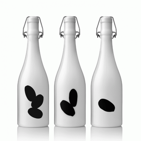
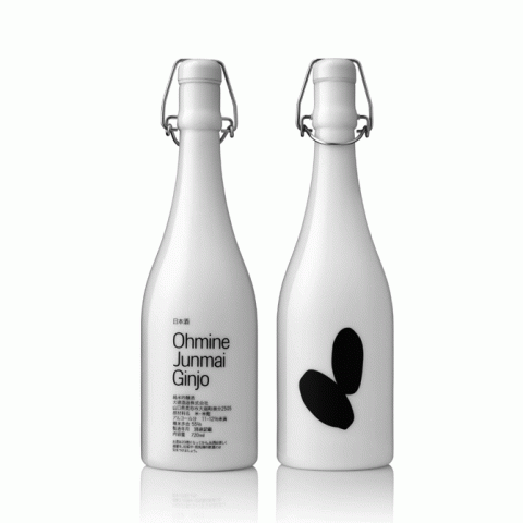
beautifully designed by swedish designer fredrik neppelberg the porcelain bottle are a keeper. however the black rice grains on the bottle do not appear to be polished and sanded enough. hopefully it will taste as good as it looks. by dd
what to drink
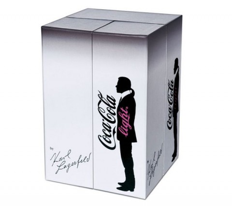
koka light: karl needs kash
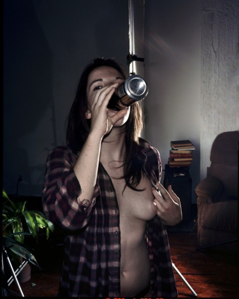
girls who drink beer, have no fear!
champagne anyone?
perfect gift 1967 chateau-lafite
absinthe spoons at bblessing
for those who love vincent van gogh, but feel a little more now, bblessing have made these super nice absinthe spoons. in the old days, holed spoons were used to hold the sugar while pouring the absinthe in the glass to make it sweeter. it’s an all-time beauty of craftsmanship but these ones are almost good enough to frame! love it! by pp’
Lagavulin 21 Year Old Single Malt
one of my favorite drinks is the lagavulin single malt. the 12 and 16 year old are amazing and less contemplative; however, the 21 year old will require some thinking if not on the complexity of its aroma, then on its price… it is not an everyday whiskey, as the taste and aroma are quite distinctive. that said on certain nights, it is a rather necessary item. the aroma is smokey as in most islay malts but lagavulin has the strongest peat flavor of all. its dry, complex, notes of sea-spray-from the island no doubt, are perfectly matched by the slightly sweet accents of sun-dried grapes (derived from pedro ximenez cask-wood in which this special edition has been double matured in). its really a drink to ponder on and get lost in…
56.5% natural cask strength, one of only 6642 bottles, distilled in 85 bottled in 2007. available for $662 making it a rather special gift. by uh
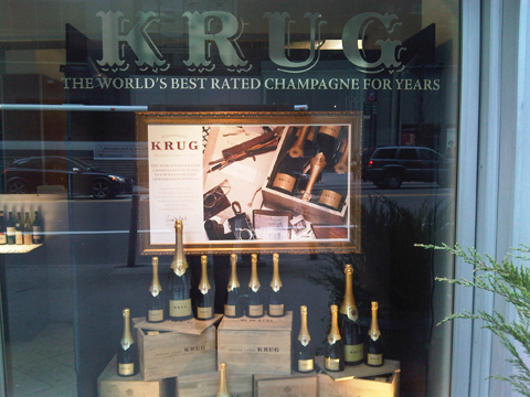
Krug champagne: clos d’ambonnay

SAV – birch sap sparkeling wine
Sav™ should be served well chilled.
when the inland ice drew back from jämtland 9,000 years ago, the birch was the first tree to reach for the skies again. when humans came to the region, the birch was the first tree they noticed. the white, innocent colour of its bark (though streaked with black, a bit like life itself), led to the birch being dedicated to the goddess frigga (or venus to those who came from more southern parts), and thus symbolised purity and femininity. children’s cradles were made of birch in order to mark a new beginning. the trees were tapped of sap, which was drunk to greet the spring.
i’m very curious, and although Sav is not available in the US, it can be ordered here. by kl
the real james bond: make it a smirnoff “shaken, not stirred”

i would say that belvedere deserves a few dollars more just for its lovely bottle, but cirac for example should be half the price of smirnoff just for us putting up with its horrendous bottle design and bad adverts. I recall as a child, my father having smirnoff and johnny walker “red” in his bar as an everyday stock, and my father, mind you, could have had anything. here I am drinking kettle one and “black” label as my bottom of the pile and my assets are 1/10,000 of his. now of course scotch is not vodka and there is a difference. but it just goes to show how our generation simply lives way beyond its means and how marketing has effected us all… even me the undisputed master debunk-er of marketing. by dd
HAKKIN SAKE
the other night i was given a bottle of hakkin sake, designed by kenya hara, and i’m very excited about finally tasting it. this sake, available for approx 10,500 yen (equal to roughly 120USD), is currently unavailable in the US and it is made the traditional way which is seldom the case these days.
hakkin is brewed the traditional way in wooden oke barrels, a labor-intensive process brought back at masuichi after a half century absence. hakkin is a historic sake which ranked highly in the all japan sake rankings at the start of the meiji period becoming an icon of a name.
specs: rice / kinmon nishiki
polishing rate / 59%
density / +10
alcohol / 16.4%
storage / keep in a dark place at 18 or below and serve within one month.
750ml, 1800ml
the best way to keep the HAKKIN SAKE is refrigerated. expiration date is 1 to 2 month after the manufacturing date. the manufacturing date is printed on the label. but after 1-2month the hakkin sake will only deteriorate in flavor. it will still be drinkable. by dd
Kenzo/Hakkin: what do you know?
the new perfume from kenzo, i discovered, was designed by japanese designer kenya hara. hara indeed used a bottle he had previously designed for hakkin sake as a basis for this. he describes the process of designing the bottle, and i must say i relate to so much of what he says:
“i designed a very simple bottle for sake called hakkin. and i realized what i was expected to do here. what i had in my mind may have been an image of design for 720ml. by changing the size, the liquor bottle can become that of perfume or vice versa without altering the shape or design.
“the bottle was beginning to form its shape but we then needed to work on the package. perfume is usually displayed on the shelf in accumulated manner so the boxes needed some creativity without over doing them. after consideration, we decided to make the box with a slight angle of inclination toward the top. by doing so, there creates some space for lights to come in from above when the boxes are displayed together. this very minor change created a tremendous effect to the box and the display, i persuaded strongly to use this idea for the box. It actually turned out to be a bit difficult to make this box with inclination but it came out nicely at the end thanks to the package manufacturer’s efforts. the package may look simply plain, but we carefully planned every detail such as paper which was chosen by its touch and texture. for the paper, we decided to use something with special features which i created in the past. this paper is unique in a way that letters become dented and semitransparent after printing. we wanted to use this paper for the box and found something of similarity in european market.”
“kenzo is a brand of colors, but i only use colors when necessary because i am a designer of “emptiness”. of course i use colors as communication method such as using red for fire extinguisher or for essential buttons on machines, but i minimize the usage as much as possible for other purposes such as design. if i am to use metal, i will use its original metallic color. when using the glass, paper or whatever the material would be, i will use their original colors. upon printing words on the product, t will use black prints without any question. as I am always piling up simple ideas as such for my designs, the design that i presented for this project too was not colorful.” by dd
 a visual collective outlet of inspiration