Jim Marshall exhibit and new book : photographs of the Peace Movement in the 1960s

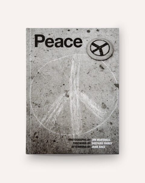
peace: photographs by jim marshall

“the peace symbol as we know it today was designed in 1958 by gerald holto”

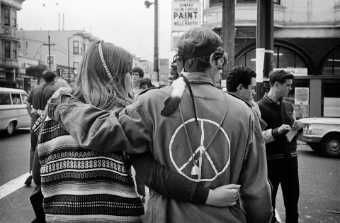
haight street san francisco 1967 (© jim marshall photography)

a new exhibit with previously unseen photographs by jim marshall at the san francisco art exchange (SFAE).

almost 60 years after the creation of the CND peace symbol, marshall’s body of “peace” photographs is a “beautiful and thoughtful reflection from one of the most celebrated photographers of the twentieth century,”

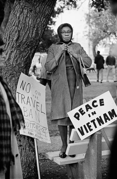
no on the travel ban oakland 1965

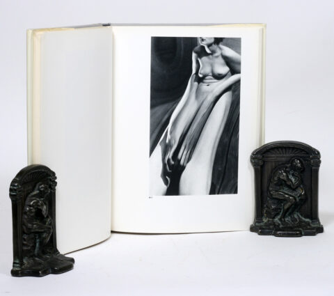
the exhibit is in celebration of the release of marshall’s new book jim marshall: peace, released by reel art press, according to a press release. the forward is written by street artist shepard fairey, the book’s text is written by peter doggett… and joan baez, provides the book’s afterword

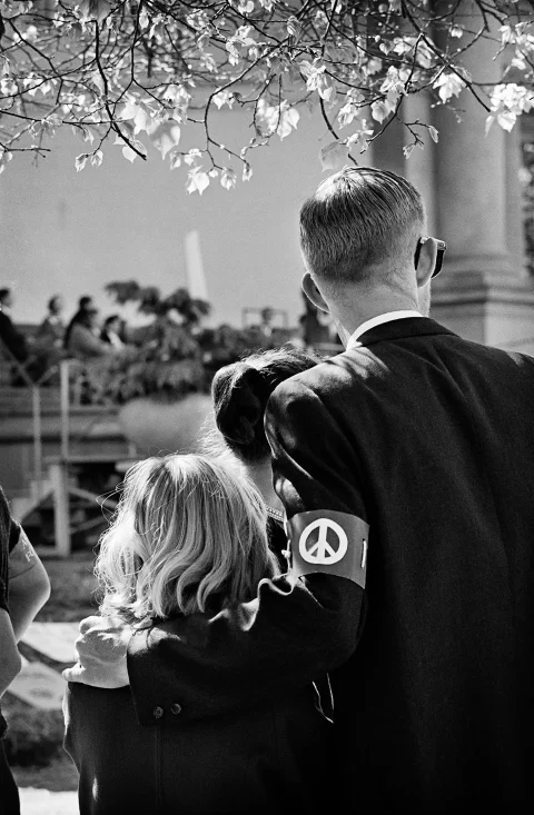
peace walk for nuclear disarmament golden gate park 1962

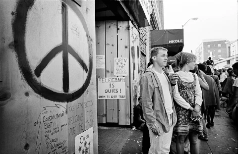
free speech rally telegraph ave. berkeley 1968

marshall was one of the most recognized photographs in the history of music. he also explored the changing times of the 1960s, photographing the creativity and celebrity. he started documenting the CND peace symbol and peace rallies as a personal project, reel art press writes. the photographs had remained in his archives until now. the photographs were taken between 1961 and 1968 across america.

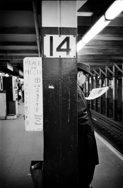
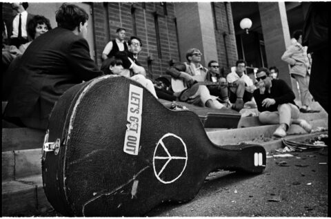
new york city photographed at newport folk festival in 1963

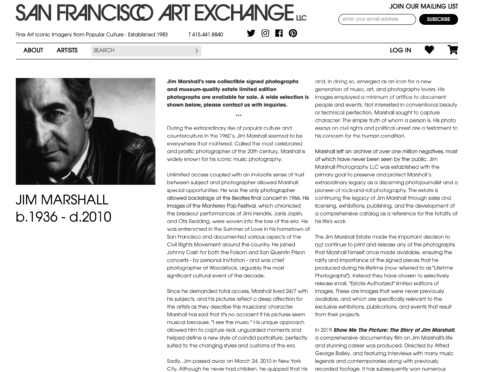
jim marshall 1936-2010

the CND peace symbol was designed in 1958 by gerald holtom for the british campaign for nuclear disarmament, reports reel art press. the symbol then spread from the uk to the us. marshall’s photographs document the symbol’s different meanings over time, starting as a symbol for “ban the bomb”-specific protests, and ending up as an international sign for peace. by xy

Stacy Horn | Bachelard | Sebastião Salgado | ECHO, And Now?

sebastiao salgado kuwait


echo, at once dead and very much alive, alone maintains narcissus’ beauty. his claim to self, that, as gaston bachelard puts it, becomes as is reflected. “je veux paraître, donc je dois augmenter ma parure.” (bachelard, l’eau et les rêves, 1942, p. 34).

the gentle stream brims with cosmic rigidity. the bank of clear waters, where things rest and can be thought to have been made, is where they take the form they pictured. a demented slumber. hypnosis. really, it is only in the depths of cloudy/violent/ruthless bodies that material imagination is most potent. there we can truly delve into matter, to find ourselves in the midst of that most gentle and fragile condition: excess. only wade these waters.

wherein do we bridge and travel past form, into matter. to much relief bachelard affirms “la matière est l’inconscient de la forme”. it is within then. materialistic phenomenology allows us this oneiric passage from one into the other.

but echo is also 34 years old. it is the life work, masterpiece, of developer and new yorker stacy holt. where form is the passkey to matter. a message board of few members, it once held great interest for a kind of crowd capable of hanging together. artists, writers, students, politicians, musicians, designers, doers, all under the banner of “and now?” a place to congregate and produce desire. a moment of permanent instigation that has been housed in a thoroughly complex mechanical network. grinding out the signals into something truly malleable that allowed its participants to call and answer to “and now?” in plastic reverie.

indeed.

though it has always been that paste, this originating material of dreaming and entry into, this giving molasses, hardens and brittles when it is driven away from its source. gross doing. mean endeavor. potential in progress left solid. scorched earth, salted terrain, prey to a drying heat. crackling sound, echoing unto itself into a vast murmur.

who decided this?


because once it’s all finished, and what we bathed in can now be held, all that will be left to ask really will be “and now? “ by lsd

S e e t h r o u g h | André Kertesz | Bill Brandt | through distortions

strange work brewing in the mind of animator s e e t h r o u g h..

this latest piece ‘union’ stirs and whirs.

s e e t h r o u g h union

similar exploration of malleable and sinking bodies is the fascinating series ‘distortion’ by photographer andré kertesz.

andre kertesz distortion series


done in the 1930s working with, and around, dada.

the book, while out of print, can be found – and should be sought out.

a few years later photographer bill brandt may have found similar distortion, in a bombed-out staircase.

On days like these, for moments like these. by lsd

LIN YUNG CHENG: On the edge between beauty and bizarre

mirror illusions by lin yung cheng


lin yung is a photographer and art director who loves to experiment with optical illusions and whimsical compositions to create images that draw the viewer into their spell. his photographs are on the edge between beauty and bizarre using a sense of poetry and grace in his work. he has a really particular style of working which is minimalistic and ethereal aesthetics. by kn

odiseo.

Screen Shot 2016-05-26 at 12.58.46 PM

Odiseo+Magazine+Vol

Odiseo+Vol

Odiseo+by+Folch-1

Odiseo+by+Folch

my latest find is odiseo – a biannual publication that offers both visual and intellectual stimuli circulating around erotic photography and contemporary essays. the most interesting aspect of odiseo is that it balances philosophical stories and essays with images that lie in between art and erotica. odiseo is a project initiated by barcelona based design agency folch.

‘we do define ourselves as erotic, but not as a magazine. as opposed to most magazines we do not seek to publish current content, but rather speculative essays dealing with topics that may or may not be of relevance in the near future.’
– pol pérez

Odessa+by+Folch

odiseo vol.7 is dedicated to the notion of truth. the issue is launched as a triptych, which was shot by photographer juan hernández. in this publication you’ll find a sensitive approach with photographic essays by one of my favorite photographers, paul jung, as well as some great written opinion pieces including eugenia lapteva and hans frederik jacobsen. by lb

kodaks vintage, classic, retro, super-8 camera: we must’ve done something right that we ‘aint doing no more

Bellami-HD1-chinon-super8

nice styling from the modern japanese bellami-HD1 camera with a modern chinon lens – but a total throw-away as a digital camera disguised in “super model” 8mm camera… lame!

yves-behar-kodak-super-8-camera

real-real… kodak’s latest backtrack on corp stupid decision making – super 8 film and a modernized super 8 camera are back, a pleasant surprise.

modern-super8-camera-fuse-project

camera designed by our friend yves behar at fuse project for kodak

kodak-super-8-yves-behar

nice stealth detailing on the side

kodak-super-8

sporting a real super-8 cartridge

super-8-Dieter-Rams-design-Braun-Vitsœ

and now for some of the old giants… above the dieter rams designed braun super-8 camera for vitsœ

Beaulieu-4008-Super8-movie-camera

the french beaulieu 4008 super-8, standard issue for all you nouvelle vague enthusiasts

canon-XL1014-super8-camera

my personal camera which i have owned and cherished for many years, the notorious canon XL-1014 super 8

NikonR10

and my best friends camera which i often use as a b-roll the nikon R-10 with nikkor lens sister to the R-8 (below)

NikonR8

and finally below one of the many renditions of the infamous pistol-grip from the berrics skate mafia

The-Berrics-super-8

ok so we owe this yet-to-be-issued kodak camera a blind review. note that we have not tested the camera as its still in production and we will post another once we get our hands on one. but top-line we are uber excited to see this amazing tool make a come back, and more importantly to see kodak supporting, and hopefully supplying, the super-8 cartridge films on a regularly available basis.

the good: its a super 8. it takes real film, and hopefully the film will not cost you your entire weekly allowance. its new and using the latest technology. keeping what worked and adding what wasn’t available. like a proper rechargeable battery that will last you the entire shoot. the design is simple and clean. we especially love the kodak revised minimal logo on the side. kodak can now process, scan, and deliver your film in one shot. love the yellow and off-white colors reminiscent of dieter rams iconic choice with braun, bringing back some of that 70’s nostalgia. usb plugs in the back. simple usability making it easy for newbie millennials… don’t forget, like em or hate em, we need those ding dongs if we are to bring some cost efficiency to the film cartridges.

the bad: it looks like a toy. the camera in its design is a reference to more of the 70’s or late 60’s units rather than the early 60’s which we personally prefer. 70’s was the era of plastics but also the era of textures which this camera has chosen to dodge at least. but the casing does not appear to be metal (again this is not factual)… if plastic, knowing mister behar, it is the finest plastic available.

the ugly: wholly shit, where is my pistol grip? how can we shoot super 8 without the pistol grip, so beloved by film fans. we even rigged one on our old hi 8 camera at some point. that said, unlike the old narrow cameras of the 60’s, this little cute baby can be held like a basket-ball for those long smooth hand-held shots, like the ones in “i am cuba” directed by mikhail kalatozov and his genius DP sergey urusevskiy.

in the end we cant wait to get our hands on one and put it to the test. thank you kodak for bringing this art back and mister behar for making it famous. by dd