this blog is a visual notebook of inspirations for a group of bandit bloggers. we post things we see and like. our lives don’t revolve around singular topics and neither does our blog. sorry! nothing is in-or-out of context here. enjoy xx
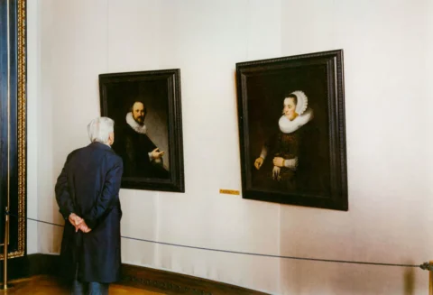
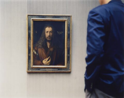
albrecht durer painted his self-portrait in 1500, so struth’s alte pinakothek, self-portrait, munich 2000 feels like a conversation between artists across 500 years. thomas struth/promised gift to the national gallery of art from the collection of robert e. meyerhoff and rheda becker.
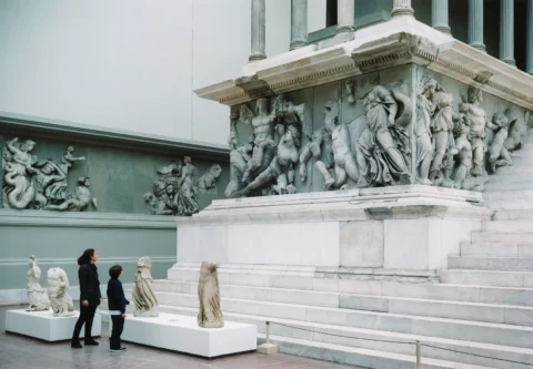
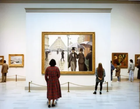
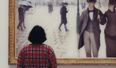
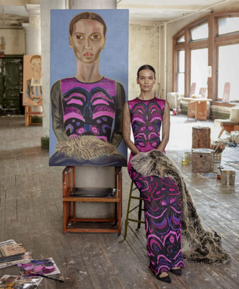
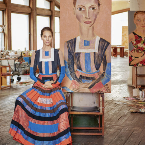
german photographer thomas struth is globally famous for his museum photographs series, capturing large, detailed shots of people silently observing iconic masterpieces at institutions like the louvre. for a more playful take, austrian photographer stefan draschan’s people matching artworks features candid images of museum visitors unintentionally matching the colors, patterns, and poses of paintings. by jp
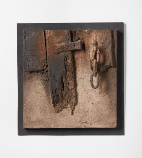
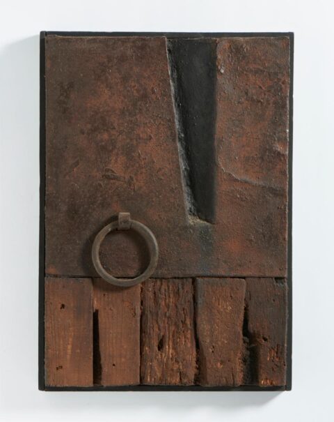
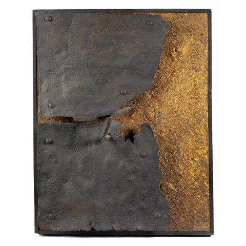
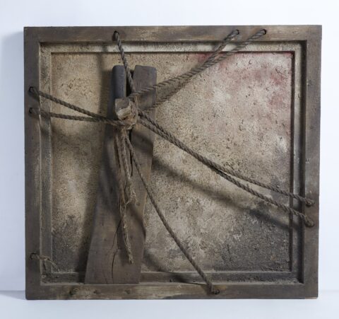
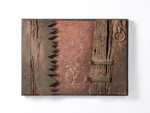
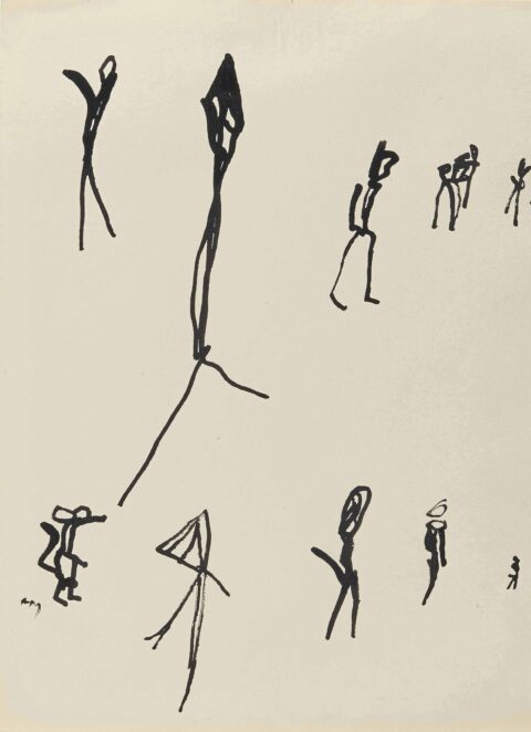
i stumbled across ferruccio bortoluzzi’s work in my last year of high school and randomly found myself thinking about it again this morning. everything feels worn down and weathered, almost like it’s been through something, but the compositions still feel surprisingly modern. there’s a really nice balance between rough surfaces and structure that keeps the work from feeling dated.
i think that’s what i’ve always liked about concretism in general… how much it can do with so little. it’s mostly shapes, lines, structure, and composition, but somehow it never feels boring when it’s done right. everything just clicks into place. there’s something simple to it but not in a lazy way. his work is built on strong compositions rather than trends, and that’s probably why it holds up so well… definitely in my books of cool shit. by tnt
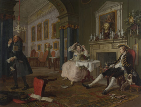
william hogarth, marriage a-la-mode: 2, the tête à tête, 1743
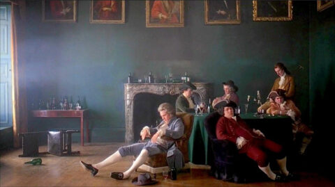
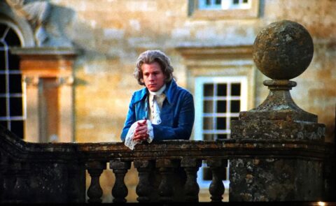
stanley kubrick, barry lyndon, 1975
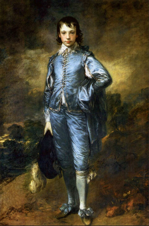
thomas gainsborough, the blue boy, 1770
stanley kubrick, barry lyndon, 1975
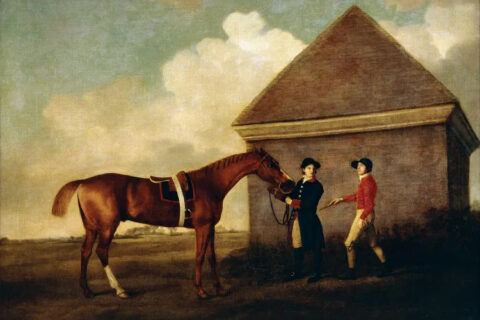
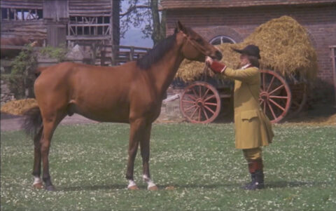
george stubbs, eclipse, 1770
stanley kubrick, barry lyndon, 1975
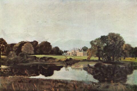
john constable, malvern hall, 1821
stanley kubrick, barry lyndon, 1975
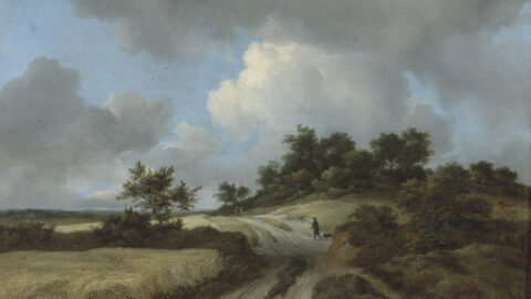
jacob van ruisdael, wheatfields, 1670
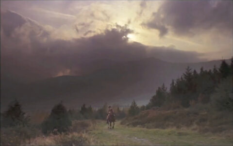
stanley kubrick, barry lyndon, 1975
watch for more of the beautiful shots from the film here
a few references that kubrick used for this film. this guy was clearly a genius… even used my favorite composition of all time by franz shubert!! by tnt
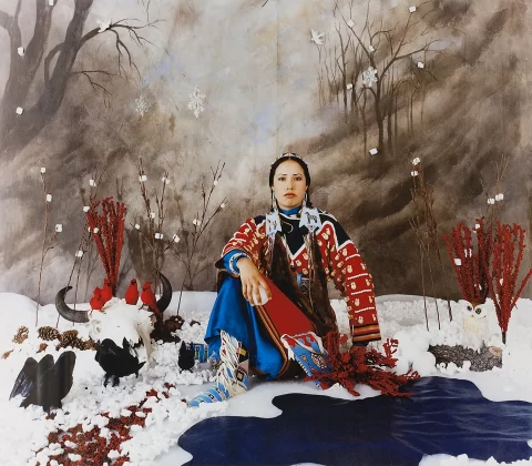
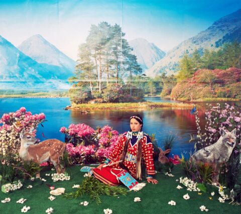
winter, by wendy red star on display at ottawa’s national gallery of canada
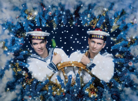
no that’s not an ad for H&M winter collection, so what’s wrong with this picture? take another look and you may begin to understand what’s actually right about it…
that is a photograph by artists wendy red star who was born in billings montana in 1981 and is an enrolled member of the apsáalooke (crow) tribe. i think red start is in a way poking fun at the romantic notions and the stereo-types, we all have of the first nation people. when in reality they are here today strong as ever, many of them are living a life no different than ours as doctors, lawyers, business owners etc. and yet they are fully connected to their roots. this is not to diminish the reality and the crimes committed against them, but perhaps as a young woman born in 1981 you may get tired of all that generalization.
her work, and its kitsch references reminded me of the work of art photographer duo, pierre et gilles, and their silly portrayals of “gayness”. while i personally dress in a sailor suit all day, not all gay men look this way… so there… that is the art.
“…red star places herself at the center of her photographic tableau, dressed in the brightly hued traditional tribal attire, which she sewed herself. featuring elk teeth and beads characteristic of crow dress, her clothing is historically authentic.
artist wendy red star is debunking myths and upending clichés about first nation and native people using “humour as a bridge” and to insure not to offend the very people whose ancestors did “the deeds”
“…by making herself the main subject in each of her photographic seasons, red crow is asserting the continuing survival and presence of all indigenous people, says cross. “by wearing her tribal regalia, she is saying, ‘we’re here, we’re not going anywhere. and what she wears is not a costume, not a stereotype, it is part of a history that connects to her ancestors and her culture and will continue to do so into the future.”
“… the exhibition juxtaposes works by first nation artists with those of canadian settlers, british and european artists from the 19th to 21st centuries as a way to both celebrate and contemplate the experience of the season from multiple cultural perspectives.
in keeping with that theme, the differing ways in which each group perceives and misperceives – as well as sees and doesn’t really see – the others is what red star is asking us to reflect on in this work.
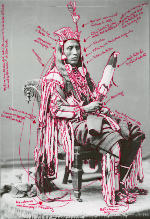
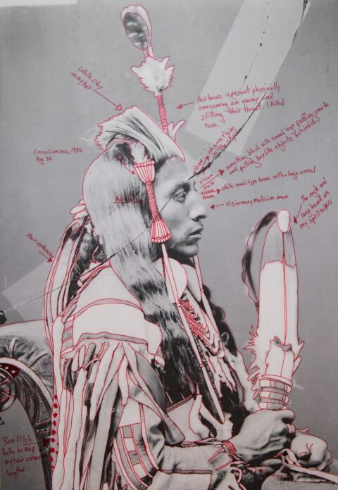
natural history museum new york
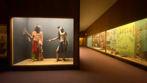
“…red star’s work talks back to the dioramas seen in natural history museums that often depict cultural habitats – including those of indigenous peoples – and treat these communities as if they were specimens for historical or anthropological study.
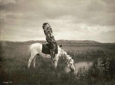
photographer edward s curtis (1868-1952)
“…they also critique the work of the us photographer edward s curtis, best known for his documentary portrayals of american indians – including members of red star’s crow nation – in the 1900s. still, red star regards curtis and his relationship to native people as complex. “his ability to photograph the different communities came through his interpreters, who were themselves tribal members… from my community he had alexander upshaw… so, when i look at curtis’s photos now,” she says, she thinks about upshaw.
that is fair but i must say i am glad that curtis managed to capture her incredible ancestors so we could stand in awe of them today. i simply wish there were more photographs documentary films and movies about their history and life. by xy
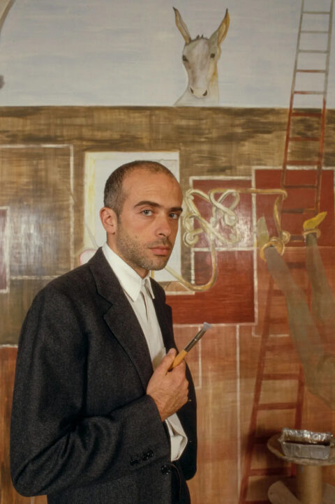
francesco clemente painting in his $5000 dollar italian suit – aey! what? hes italian!
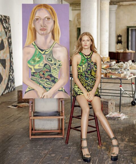
francesco clemente terrible painting Nº 1 of model anna ewers… not that you can tell
francesco clemente terrible painting Nº 2 of model liya kebede.
francesco clemente terrible painting Nº 3 of model christy turlington.
oh well that’s how it goes. if you are mediocre at what you do and willing to go along down the river, you’ll get the money, and if not that, you at least get the girls. by dd
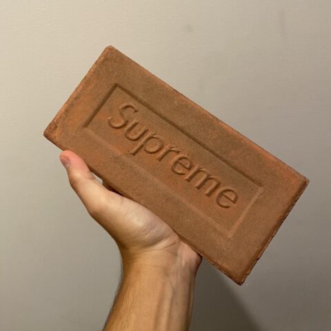
“i bet if we made a fucking brick with supreme on it people would pay $40 each…” so they did and they did pay. today you can pick one up for $300 on stock x
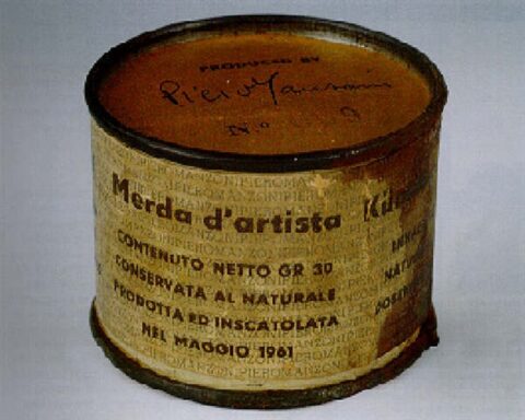
artists shit, original price unknown… piero manzoni’s shit now sells for $300,000 an ounce
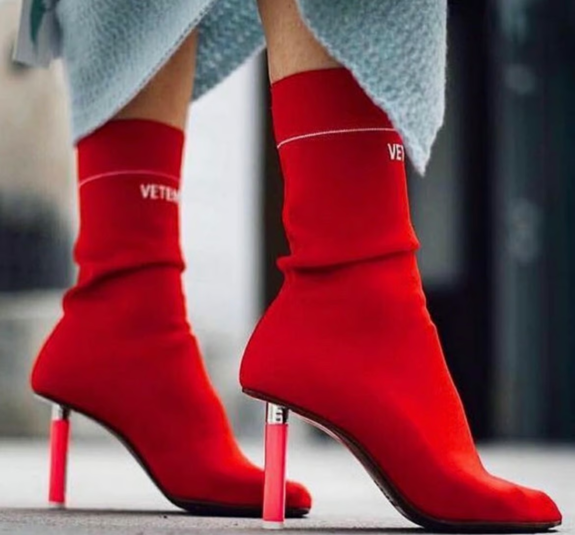
demna’s vetements boots with plastic disposable lighters as heel – price for a used pair approx $450
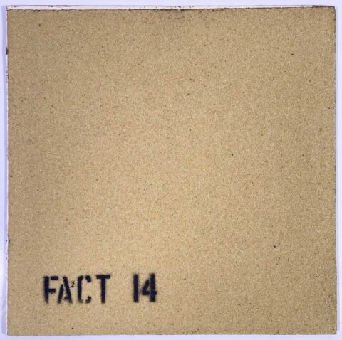
the album cover to destroy all others… peter savilles fact 14 LP cover made of sandpaper, to gently destroy all your other LPs.
lou doillon in vanessa bruno, if video is unavailable click here
french fashion designer vanessa bruno is presenting a truly beautiful video to illustrate her winter collection. featuring lou doillon, the movie is perfect fit to this “no mistake” brand from their cloths, their unconventional campaign shot by mark borthwick to this movie. bien joué! by pp’
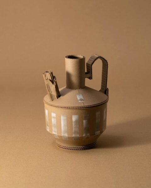
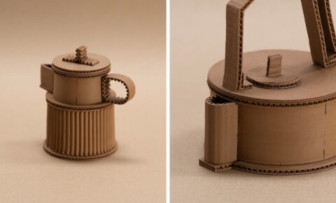
water tight ceramic – not cardboard – cool minimalist ceramic
at first glance, you’d be forgiven for thinking that if any of jacques monneraud’s vessels were filled with water, they’d soak right through and split at the seams. and that’s exactly what the artist wants you to think! incredibly, these vessels are made of clay.
monneraud’s pieces appear lightweight and almost haphazard as if repurposed quickly from corrugated cardboard. of course, only meticulous attention to detail could result in such fantastic visual trickery. “i really liked the idea of being able to freeze fragility,” he tells colossal.
the artist began working with ceramics only three years ago, establishing a studio in southwest france where he continues to experiment and expand upon his love for the medium. his new interest developed almost by chance, following something of a creative drought. he says:
what a cool clay teapot – in unglazed clay
i started as a graphic designer/illustrator and quickly became a creative director in an advertising company. during those years, i gradually drifted away from what i loved to do in the first place, which was creating. as someone who grew up in a family of artists and makers, i always pictured myself working with my hands someday. but here i was, spending hours in meetings discussing brand strategies. when i realized that, i decided that it was time to give this dream a try. after a few months searching for this “maker job,” i stumbled upon a video of someone working at the potter’s wheel. i was instantly hooked.
monneraud immediately booked a workshop to learn the basics, and a few weeks later, he quit his job to pursue pottery full-time. through the inherent process of trial and error, he learned and grew from failure. “i was unsuccessfully trying to obtain a specific glaze effect that i love, so i started thinking about a ‘raw collection’ made of unglazed pieces,” he says. read more at colossal. by ty


