
 brilliant, beautiful and cheap! no, not the ideal woman 😉 it’s the 98% biodegradable pen with non-toxic ink designed by young new york local, leon ransmeier. leon is a part of the design group rich brilliant willing and even though his breakthrough design was with droog in the netherlands he has more of a japanese sensibility than dutch … ‘‘i’m not interested in conceptual one-liners,’’ he says. ‘‘i want there to be a very clear reason behind everything i do.’’ by kl
perfect gift
best made axes – lumbers in tha city


i guess anyone walking to partners and spade, saturday surf shop or any trendy store in the city wondered what the hell is that about to sell axes?!? and i guess i’m not the only one fed up by half the population in nyc fucking around in lumber jack outfits while they never set a foot in any forest but anyway… those axes are really gorgeous. even if i wouldn’t harm a tree for anything in the world, i could really imagine one of these beauty in the corner of my living room. that would be a bit yuppi-ish, aint it? so just for eyes by pp.
hotel labels – lv coffret


saw this box on nice french blog djgm and found it really cool. this is a nice coffret edited by vuitton, there is 30 postcards in there, all die-cute and nicely printed as the old hotels labels from around the world. the box is made out of a re-edition of the 30’s lv print. really calling off a certain era and it’s style. love when fashion brands do things that are not just so irrelevant. by djgm + pp.
le corbusier – his true colors

amazing article by alice rawsthorn in the new york times about le corbusier’s wall colors, must read here, a couple of lines for lazies:
“by 1931, le corbusier had settled on a palette of soft pastels and brights to accentuate white, and arranged for them to be reproduced on wallpaper swatches by the swiss manufacturer salubra. esver the control freak, he specified exactly ho salubra should group the colors together to indicate which ones could be combined.”
…
“a book of all of the swatches made for corbusier by salubra from 1931 to 1959 was published by birkhäuser in 1997. a young chemist, katrin trautwein, the co-founder of kt color, then started to explore the possibility of manufacturing the paints and secured a license to do so from the fondation le corbusier.”
by ar+pp.
williams british handmade luggage


how witty is that? not easy to stack in a trunk but do you really use a car when you carry these luggages? williams british handmade by pp.
say hello to my little friends
 here are the newest additions to jimmyjane, pleasure to the people, by our little yves-eeee. by dd
enormous champions tea towels


these hand printed towels by enormous champion (brooklyn, new york) are super cute. got two for my little 4 year old loves. made in the USA on 100% belgian linen. the linens are a lovely shade of natural “oyster”, and silkscreened with a warm grey ink. they look just as good, used as hand towel, or simply framed. $25 each… a bit steep but worth it to me. thanx pp. by xy
ok we just died and went to heaven… in copenhagen: Harley Davidson Sportster

 standard frame ( raked )
 rearshocks
 WM handlebar, tarozzi footpegs, 19″ firestone deluxe fronttyre
 WM seat and seatcowl
 front fork
 16″ firestone deluxe reartyre
custom motorcycles copenhagen is featuring a harley davidson sportster: club black #02 featuring standard frame ( raked ), engine, swingarm, rearshocks, front fork, wheels. 16″ firestone deluxe reartyre, 19″ firestone deluxe fronttyre. WM seat and seatcowl, WM tank, WM handlebar. tarozzi footpegs. WM exhaust. WM custom paint. available at wrench monkees but not for sale but as always everything is negotiable. what a gift this would make! by dd+pp’
pierre hardy + hermes


just heard about this collaboration between designer pierre hardy and hermes on some jewelry. he was already designing some fabulous shoes for the H brand but the jewelry is really swell! good job! by pp’
tintin and milo figurines: i mean who wouldn’t want this?


 ok for all you tin tin and milo, old-school-ers looking for a perfect gift for that favorite niece of yours, here it is. it can be hard to find these guys in the united states but i finally did (sold here), and got the missing pieces for my favorite girls, made the girls and their daddy super happy… (also check here). by dd
fan di fendi – fendi’s newest fragrance launch: out in september 2010
 after fendi pulled all of their existing fragrances off the market, for over a year, there was a vacant spot begging to be filled. “fan di fendi” is the newest launch due in stores this september 2010. the simple yellow packaging and the proportion of the bottle are quite beautiful and summary, however the name is a little uncool for our taste. not only it sounds odd upon first read, its rather a direct derivative of the very successful j’adore dior. one would have expected karl lagerfeld to resist it just for that, but one can see how such a name can make marketing directors and the family filled with excitement. after all who doesn’t want “fans”… or for that matter to be “adored”. the only problem is that naming it that doesn’t necessarily make it so. the jus is signed by perfumer delphine lebeau-krowiakj and the ad campaign is, once again, created by mr baron (yawn!) and features models anja rubik, abbey lee and karmen pedaru suspended in a moment of rock and roll ecstasy.
for the record, our favorite fendi has always been the original classic “fendi by fendi”. the 70’s scent was delicious but unfortunately found it’s way into the low end retailers in the 80’s and the rest was histrory. with a bit of re packaging and updating that scent could find a great spot next to the latest, and we hope fendi will consider bringing that back. by dd
brian eno’s oblique strategies cards

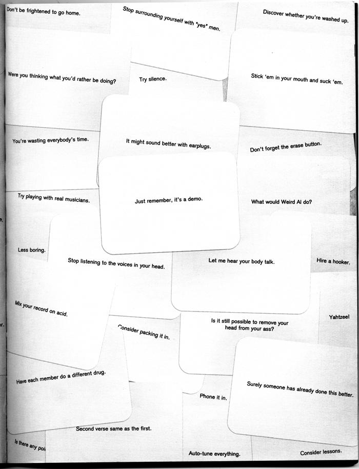
was listening to a re-aired jim jarmusch’s interview on french radio and remembered that he was talking about this oddity that is brian eno’s “oblique strategies” deck of cards. that sounded pretty fun on the radio but the truth is that it’s far beyond that, that is pure genius!
“the deck itself had its origins in the discovery by brian eno that both he and his friend peter schmidt tended to keep a set of basic working principles which guided them through the kinds of moments of pressure – either working through a heavy painting session or watching the clock tick while you’re running up a big buck studio bill. both schmidt and eno realized that the pressures of time tended to steer them away from the ways of thinking they found most productive when the pressure was off. the strategies were, then, a way to remind themselves of those habits of thinking – to jog the mind.”
let’s imagine a deck of cards that is giving you advise on a daily basis. in the interview, writer jean jacques schulh was telling jarmusch’s fortune. the instruction was “do something boring” great piece of advice! i ordered a set, next posts will be defined by the cards… by pp’