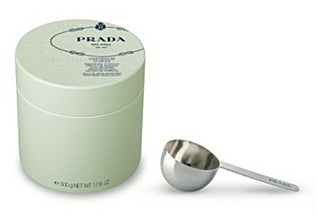
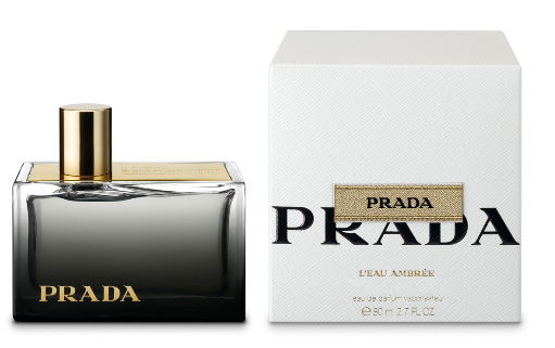
so what does a luxury brand like prada do when everyone’s trying to be lux? seeing the latest logo treatments at the parda store made me wonder for a bit… i saw a random half cut logo on the cap of some cosmetic pack, the fragrance box with the double logo on the box, one covering the other… like someone saying their name twice upon introduction. the first name quietly and muffled and the second, bold and pronounced. this of course is a major no no in design, but with fashion in general anything goes, all bets are off. they even make wallpaper patterns out of their logos (i bet that made the marketing directors excited), i cant help but equate such behavior with one of those tacky celeb PR shots infront of some logo plastered wall for some vodka of the day, after all that’s the real purpose, so lets not be shy. but this is not always the case with madam prada. not only the double logo is there for no good reason, they took great pains to design it as thought it was haphazardly placed over the second, or even better, just casually running off the cap. like one of those “i just woke-up” haircuts that took hours to do. but to their credit what else could prada do? whatever prada does is knocked off within weeks, i mean every monkey now has a perfume with one of those ‘squeezable testicles’ that prada reintroduced… maybe this is the latest way to separate yourself and say… ok you wanna follow/copy me? go right ahead… i’m jumping out the window. by dd