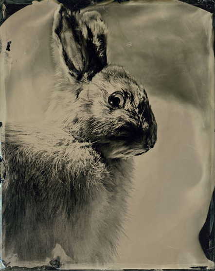
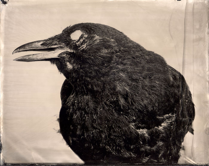
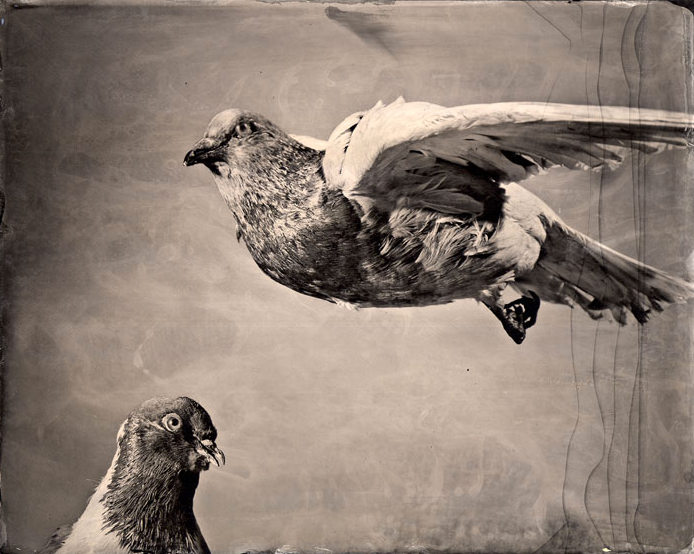
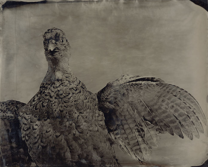
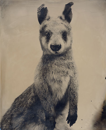
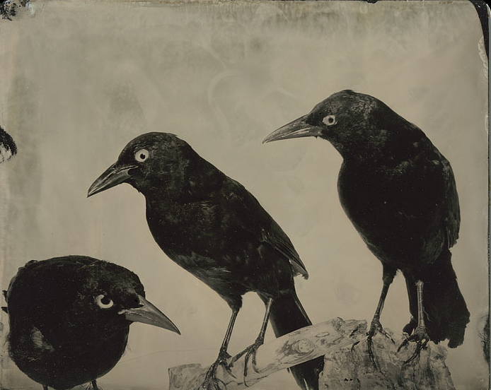
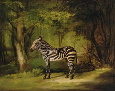
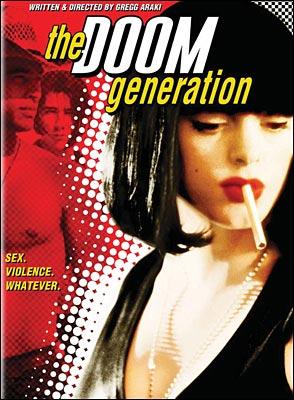
this blog is a visual notebook of inspirations for a group of bandit bloggers. we post things we see and like. our lives don’t revolve around singular topics and neither does our blog. sorry! nothing is in-or-out of context here. enjoy xx
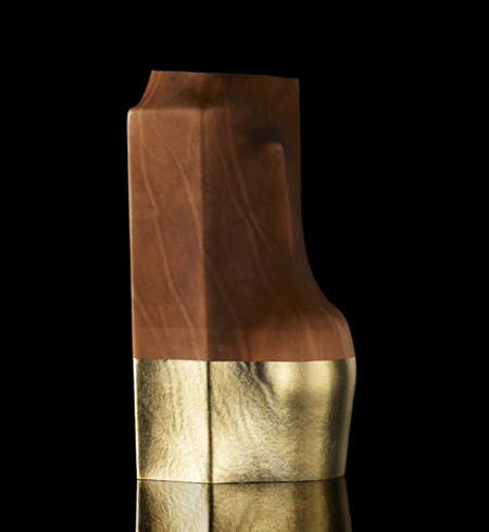
i’m currently into designer simon hasan’s work. using a medieval technique called something like “boiled leather”, he’s really proposing an interesting alternative to the boring space/hi-tech style that designers seem to have difficulties to move away from…
if you have a chance, check the hand-made issue of wallpaper magazine that features a story on him re-doing a poltrona frau seat his way, super interesting (as is this all issue)by pp
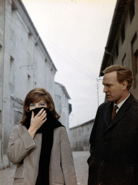
a troubled monica vitti with british actor richard harris who walked out on antonioni after asking antonioni “why am i walking across the field?” to which antonioni replied “you’re an actor, you don’t question me, you do what i tell you to do”
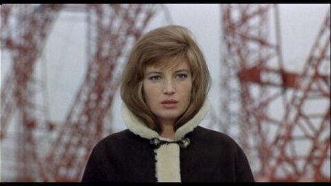
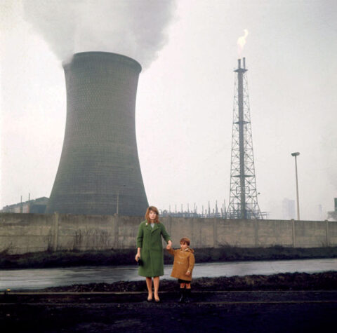
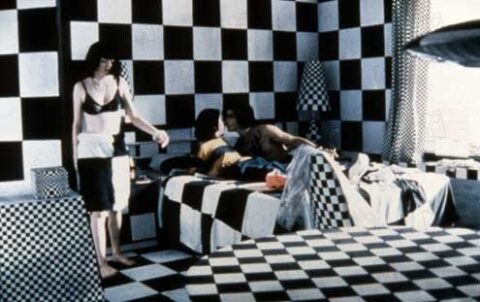
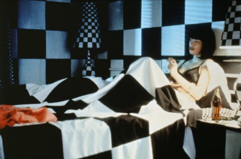
entire streets, grass fields and buildings were painted to achieve the color
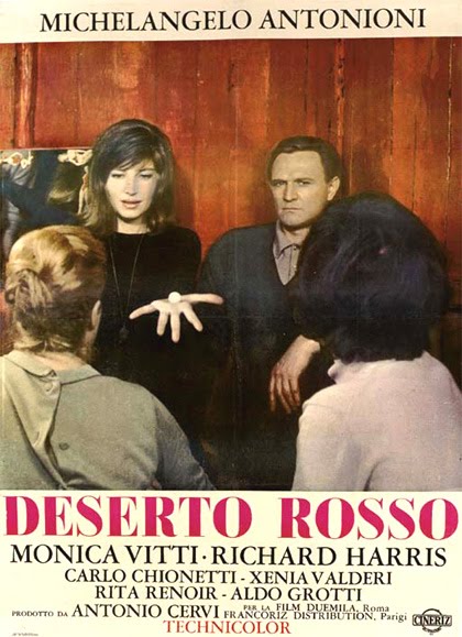
talking about deserts…. this is what you can call a great film, i saw it again tonight for the 4th, or 5th time, and it was as if i was seeing things for the first time. granted i’m rather forgetful, but that’s another story. the color and composition in this film are rather extraordinary, antonioni is the painter rather than the director in this film. so much pain was taken at the time in 1964 to create the color palette that antonioni was after on this technicolor film, including painting entire stone streets brown, buildings black, trees white, leaves brown, trash gray, earth red not to mention the “gray” fruit… it’s truly a beautiful film, and worth seeing it with no sound just purely as a visual feast, a rothko painting of sorts.
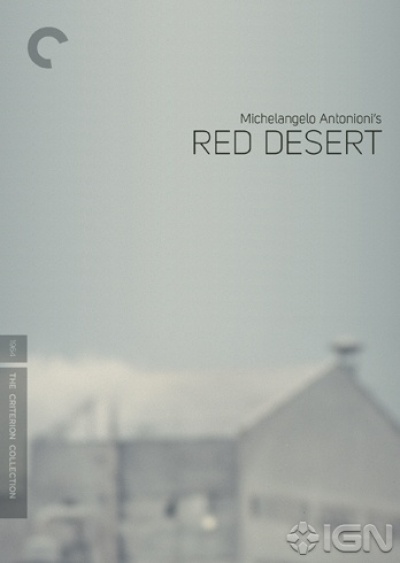
audio commentary by italian film scholar david forgacs (this is quite nice), archival video interviews with michelangelo antonioni and monica vitti and a booklet featuring an essay by film historian mark le fanu, an interview with antonioni by jean-luc godard, and a reprinted essay by antonioni on his use of color plus the usual other crap on such discs. with many thanx to cdc. by dd
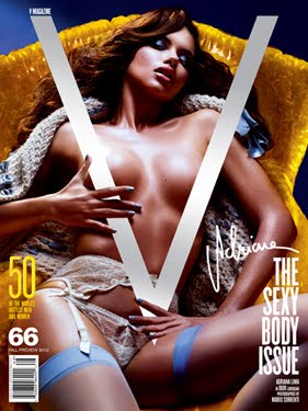
we know that times are desperate, we get that bomb-shell curves are back in (granted not by choice rather by necessity of our western obesity), but can someone please explain what v magazine is doing/thinking. absolutely crass, mundane and uninteresting series of covers. you can add this to the bang ad by marc jacobs (see post). seems like crass/kitsch taste is quite back in fashion. quite happy to be well outside of it.by dd
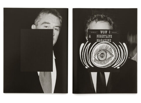
i would personally never buy a magazine featuring mister zahm’s night accomplishments but i have to admit that their art director (gianni oprandi) is really on top of it as usual!by pp
don’t know why but i have been listening to cat power and devendra banhart almost exclusively. i recently bought their cds on amazon as the mp3 downloads i had where just not of good quality for such amazing music.by dd
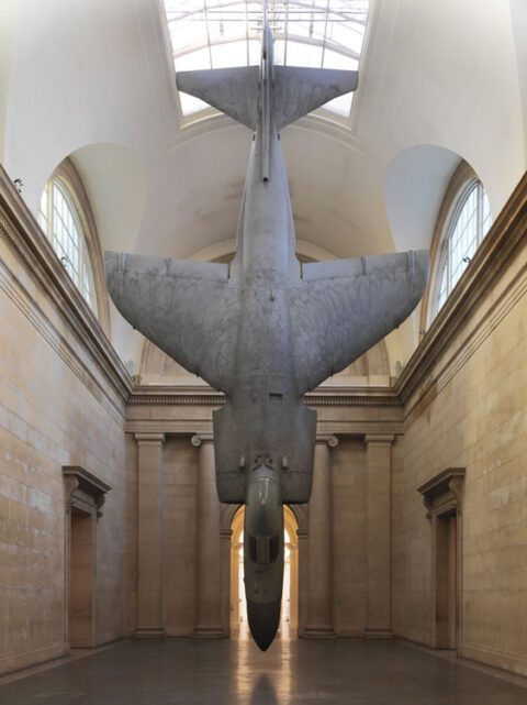
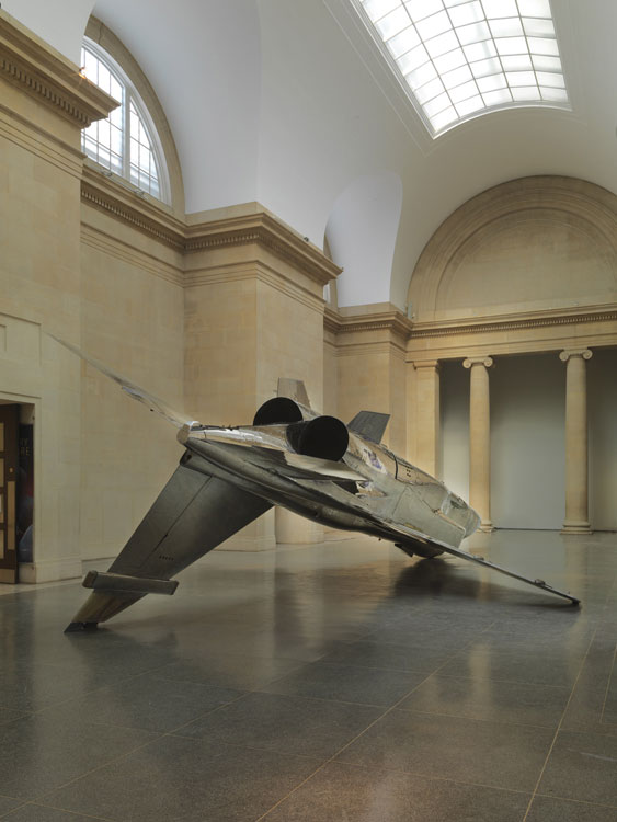
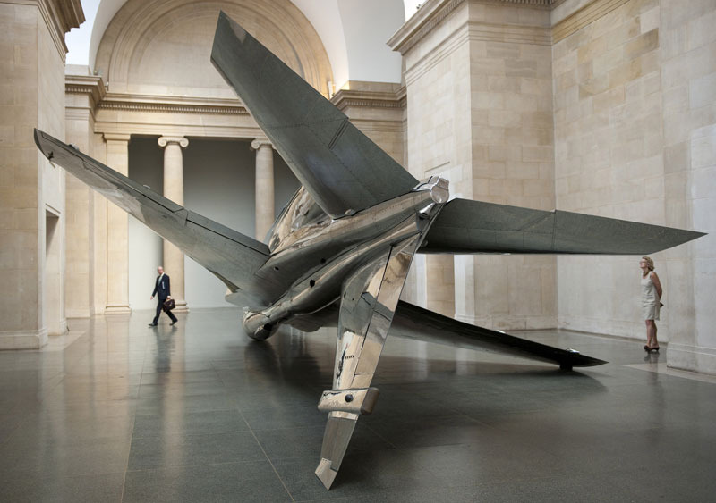
i came across a recent commission of fionna banner by the tate britain. i must admit that i was unaware of her work before and feel like i’ve walked into a world i’ve been missing out on. her fascination with the emblem of the fighter plane gives us these elegant arrangements. she sees them as the ‘opposite of language’, used when communication fails …”harrier and jaguar remain ambiugous objects implying both captured beast and fallen trophy.” if you’re in london you can catch this exhibition until january 1011. i will definitely be exploring more of this delicately abrasive artists work.by kl


