design
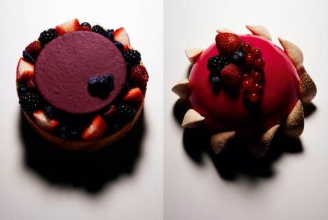
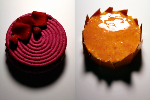
pierre herme – guido mocafico
having guido mocafico shooting still lifes of pierre herme’s cakes is great, make total sense. (could have been pushed further, though). anyway, now i’m hungry by pp.
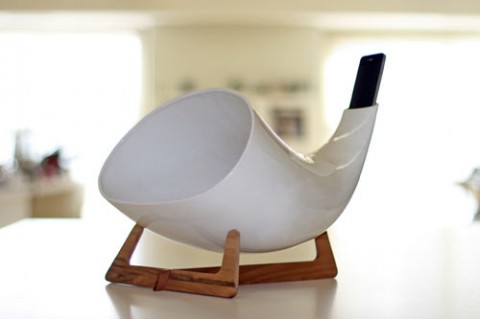
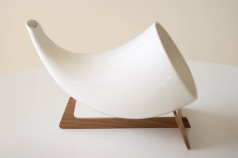
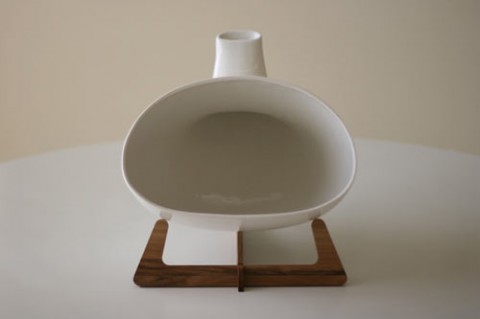
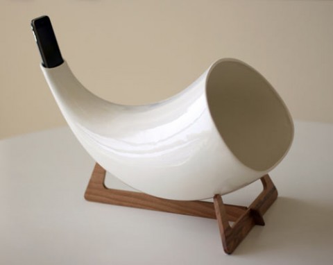
iphone megaphone by en&is
Original Marcel Breuer armchair: 1922 weimar
advice for young lovers
mucu: make a note of that
sorry don’t mean to be such a design geek but when you see something like this you just want to get a carton full. beautifully simple notebooks by mucu for under $20. by dd
DON’T FADE AWAY: concept design chair
i’m not generally a fan of ‘obviously designer’ chairs but i must admit this one by nendo 2009 was quite intriguing. wood with clear and pigmented acrylic. by dd
rick owens – furnitures
after the first chairs, a cross between donald judd and prehistory, rick owens is showing new pieces out in his london store. as always, it’s quite beautiful in it’s architecture and massive aspect. by pp.
philographics
another well done series of minimalis symbolic posters. i can’t remember if our last posts were done by the same person, but these attempts to explain complex philosophical theories through basic shapes were sorted out by genis carreras. The resulting graphics are simple, bold, and most importantly, meaningful. see more here. by kl
classic
that magic touch
calligraphy and penmanship was once a signal to education and social class. this is lost in our now buttonless world, but it has created the next realm of bespoke, which is made-to-measure penmanship. nicolas ouchenir is one of the only serious calligraphers out there, and is developing his craft beyond beautiful writing, and pushing his chirographic talents by creating bespoke alphabets for each of his clients. “calligraphy might be an age-old trade but it follows current trends,” he says. “from gareth pugh’s violent lettering to kanye west’s signature-like alphabet, it’s a craft both timeless and ephemeral.” by kl
in love with alexey, how bazaar
how cool was alexey brodovitch back in his day! diana vreeland wasn’t the only progressive nut-ball making harper’s bazaar amazing from the 30’s to the 60’s.
alexey was prominently influential in introducing into the united states the radically simplified graphic design of modernism. through his teaching, he created a generation of designers sympathetic to his belief in the primacy of visual freshness and immediacy. fascinated with photography, he made it the backbone of modern magazine design as photography was previously used sparingly, and he fostered the development of an expressionistic, almost primal style of picture-taking that became the dominant style of photographic practice in the 1950s.
basically, brodovitch is the model for the modern magazine art director. he did not simply arrange photographs, illustrations and type on the page, actively conceived and commissioned all forms of visual communications, as well as specializing in discovering and showcasing young and unknown talent. his first assistant in new york was irving penn. he also nurtured photographers such as leslie gill, richard avedon and hiro.
his impact on media, fashion and editorial expressions of harper’s bazaar made him a bit of a celebrity… for example, the film funny face which starred fred astaire as a photographer much like avedon, named its art-director character “dovitch.” by kl