
its not so much that we love the design, but we love the idea and the bag itself feels and is quite special. everyone should have at least of of these, 1- you’ll be supporting a great nation with so much to admire, 2- you’ll be sporting an item blessed by yohji with out dropping thousands, 3-this is no typical canvas bag, there is coating/treatment on the fabric that makes the material feel quite special and nice, 4- its made in u.s.a., 5- it’s only $10… only disadvantage is how much of that could possibly be going to japan as the bag itself feels like a $60 item already. that said head down to the Y3 store, at 92 greene st, between prince and spring in soho and grab one for your next grocery visit. by bh
design
celine tote leather bags


i was at barney’s a few months ago where i picked up my 2nd goyard tote and finally saw these celine bags that we wrote about in 2010. i seriously considered them, for almost a $1,000, a few hundred less than the goyard canvas and gum totes, these ubber soft leather bags are a clear choice, however i ended up with the goyard as i just could not see these celines handling the weight of my laptop on a daily basis. that said this is perhaps the last frontier that has yet to be knocked off by the exclusive ateliers on canal street. so at least you’ll be in style for a few more months. by dd
dieter rams – as little design as possible


 phaidon is releasing a book on dieter rams, it’s called “as little design as possible” and i think it’s pretty nice to be able to see the places where designers ( or artists or whoever) work. i always found so inspiring to see studios and homes… well that’s maybe my “voyeur” side… anyway, here we see that mister rams stick to his guns, studios are as strict as the design! by pp.
wow! Jean prouvé meets gstar


its so crazy to see this as i just bought an old book on prouve! i never thought he was that popular to be introduced along with some clothing brand? the fashion house, g star raw, is teaming up with vitra to re-imagine several iconic pieces from the prouvé’s archive for the new prouvé raw line. as much as i hate to see prouvé be marketed this way i must say the stuff looks amazing, and in g star has helped reintroduce his work then it cant be that bad after all. i want ’em all. by dd
smoking kills man… but hell it lookS good**

great cover for man magazine. mind you, this is not just “another man” magazine.
**official disclaimer: smoking actually does not look good. it actually sucks!! not that we care about death, its quite natural and we best get the fuck out of here if there’s gonna be any room left on earth for the ones coming. besides as we posted before the true average life span of man is really just 20, and the rest is really borrowed time. all that said, and the death part aside, it is simply stupid to shove carbon monoxide inside you mouth especially when the final effect is null. your teeth get yellow, your mouth smells like a toilet, and it actually cramps your style. just think about what an extra ($12 a pack x 7 days x 4 week in a month) $336 a month could do for your wardrobe… actually if you are in paris or NY not much… but whatever. by dd
can your pencil do this?

a pencil is mightier than the pen. by dd
koka light: karl needs kash

ok i’m willing to believe for a minute that karl simply didn’t do this for money but because he really loves diet coke and drinks it daily, but then there is barbie… KArl it seems does need KAsh! and chanel doesn’t seem to be doin’ it. by dd
bmw r7


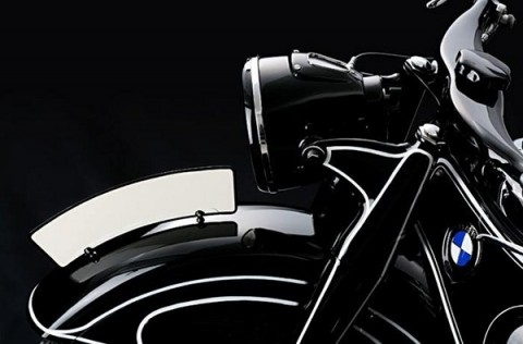
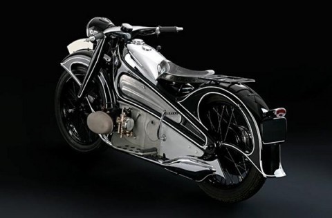
they don’t make ‘em like they used to. while metal rusts and muscle weakens, the junk yard is not always the fate for our auto motive history. this killer art-deco motorcycle was locked in a crate after its production and stayed there for over seven decades. in 2005, that crate was cracked to expose this automotive work of art, the 1934 BMW R7 motorbike by bn
while we are on logos: the johnnie walker logo story
![]()
the johnnie walker NEW logo above and the OLD logo below
![]()
note how in the NEW and improved logo johnnie is walker from left to right vs the old logo right to left. supposedly some poor sod convinced johnnie walker that in the old logo johnnie was walking the “wrong way”! they spend well over 6 figures changing this logo and i must say the old one look better to this day. also I like to know how many people noticed or for that matter cared which way johnnie walked. all that aside black label is my whiskey of choice when on a budget. by dd
Hermes + Coach: isn’t it nice when people are simply happy just being like someone else?
![]()
![]() which carriage would you like to be on? this is the result of either a hack designer or a loser client. you know, the kind that is happy being number two and feeding off number one’s crumbs. either way, it’s a logo design disaster not much unlike the donna karen / david yurman logo debacle created by mr. fabien baron. there is plenty of this out there. by dd
which carriage would you like to be on? this is the result of either a hack designer or a loser client. you know, the kind that is happy being number two and feeding off number one’s crumbs. either way, it’s a logo design disaster not much unlike the donna karen / david yurman logo debacle created by mr. fabien baron. there is plenty of this out there. by dd
charlotte perriand – photo to design


i’m sure this exhibition is allover paris and french medias but here in new york, not so much. that is a very cool one, not another perriand/corbu show with the same book that is not bringing anything fresh to the talble. here, curators at “le petit palais “ put next to each other the photographic work of miss perriand and pieces that result from it. really interesting! is it a bit naive if i say that i prefer some of her photos over some of her furniture…
“from the fish bones that prompted her ‘banquette tokyo’ to the reclining figure that inspired her ‘chaise longue basculante’, the photographs lay bare her creative process. perriand began using photography for preliminary studies from the moment she joined the le corbusier/pierre jeanneret studio as furniture design associate in 1928, looking at the ‘laws of nature’ in urban and mountain contexts, and many of the 380 photographs show objects discovered on her many walks.” via wallpaper
by pp.
font that tshirt: Masashi Kawamura


 “T” shirts are shirts that were designed by masashi kawamura to have the silhouette of 5 famous typefaces; helvetica, caslon, baskerville, courier, and cooper black… the above two displayed on mandy harris and kana-kimura (aka bob’s girlfriend). more info now idea / utrecht (www.utrecht.jp) by dd