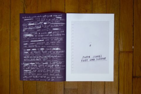
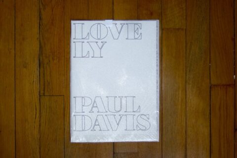


some more books by the incredible designers books website. here is the grand paul davis‘ book titled “lovely” as you might guess. well, that’s lovely indeed. by pp
design
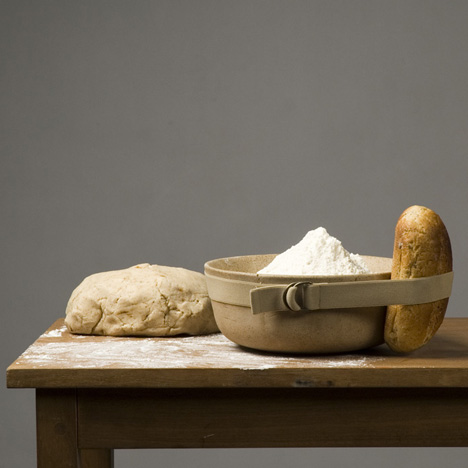
food + design = heaven
geoff mcfetridge – recent work
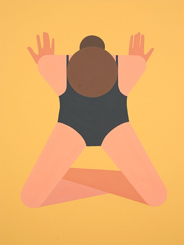

ok, that show is already over for quite a long time now but anyway, loved mister mcfetridge’s work and even if the wild things are things were not my cup of tea, the followings are.
this show took place at the great half gallery ( which is unfortunately a bit chaotic in it’s opening hours…) just mist it, too bad… by pp
memphis vs. moss


celebrating the 30 years anniversary of cult italian design movement memphis. moss commissioned artist nathan sawaya to recreate sottsass’s iconic memphis work, “carlton“.
it’s in moss window and it’s really nice, using legos makes total sense. great! by pp
hansen family – trunk & drunk
![]()


love the atypical path of gesa hansen who decided to take over her family savoir-faire and added her designer experience to create hansen family. they describe it as: handmade furniture, homegrown wood, new scandinavian design. the bottom line is that they bring a new look and a twist to iconic scandinavian designs. my personal fav is the trunk inspired bar called “drunk” above! love it! by pp
the pen is mightier
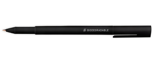
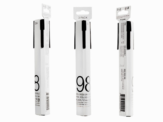
brilliant, beautiful and cheap! no, not the ideal woman it’s the 98% biodegradable pen with non-toxic ink designed by young new york local, leon ransmeier. leon is a part of the design group rich brilliant willing and even though his breakthrough design was with droog in the netherlands he has more of a japanese sensibility than dutch … ‘‘i’m not interested in conceptual one-liners,’’ he says. ‘‘i want there to be a very clear reason behind everything i do.’’ by kl
best made axes – lumbers in tha city
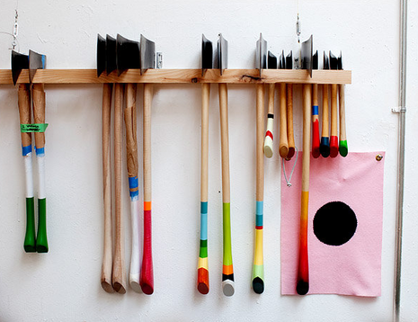
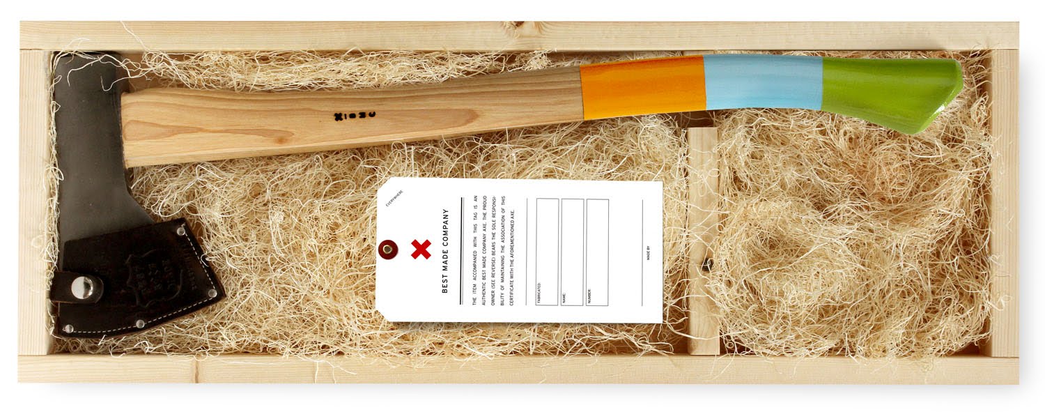
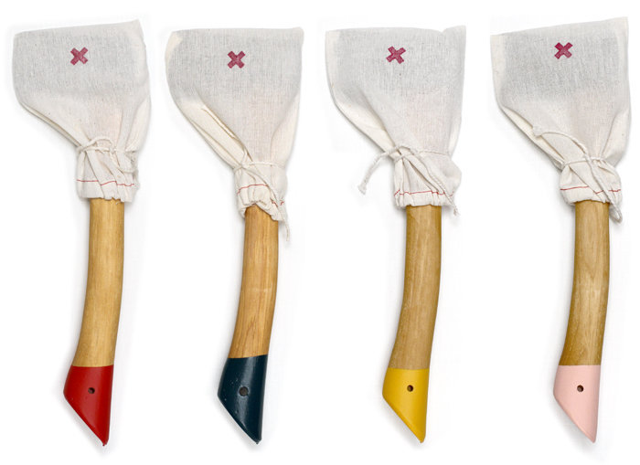
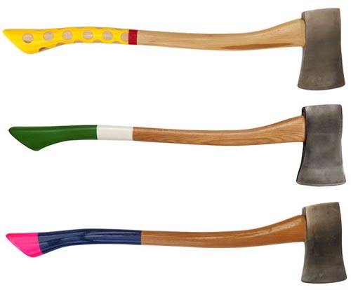
i guess anyone walking to partners and spade, saturday surf shop or any trendy store in the city wondered what the hell is that about to sell axes?!? and i guess i’m not the only one fed up by half the population in nyc fucking around in lumber jack outfits while they never set a foot in any forest but anyway… those axes are really gorgeous. even if i wouldn’t harm a tree for anything in the world, i could really imagine one of these beauty in the corner of my living room. that would be a bit yuppi-ish, aint it? so just for eyes by pp
gap logo redesign – laird & partners
![]()
sorry about previous post, it seems laird & partners are fully responsible for the crap. my mistake
(any point of view, though?) by pp
gap logo redesign – crap or scam?

well, i guess everyones read about the gap logo issue, for those who live in caves, gap showed the redesign of their logo last week on the web. designers, along with customers and regular folks just trashed the design all over the world. all this pressure on the brand lead them to do an announcement that they would step backward and get their old logo back.
that is not a wrong thing since the redesign was actually a real crap but what is strange is that no-where on the net i found any article talking about the agency responsible for the redesign. when tropicana faced the same story few month ago and went back to their old packaging, peter arnel studio was clearly made responsible. on the other hand, who the hell would came up with such a lame logo? laird & partner that are in charge of their image? i don’t think so.
anyway my point is that gap never intended to replace their logo but to reinforce it, so they came up with the crapiest thing ever and let the buzz grow to eventually let their consumers think the brand really cares about their comments and involvement. is it making any sense? by pp
hotel labels – lv coffret
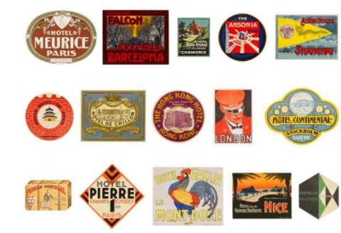
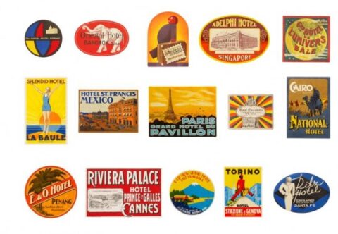
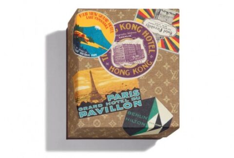
saw this box on nice french blog djgm and found it really cool. this is a nice coffret edited by vuitton, there is 30 postcards in there, all die-cute and nicely printed as the old hotels labels from around the world. the box is made out of a re-edition of the 30’s lv print. really calling off a certain era and it’s style. love when fashion brands do things that are not just so irrelevant. by djgm + pp
few of my favorite things


few of my favorites from the lovely jjjound… as much as we love him, we just wish that he would credit the work. isn’t that expected in a way? by dd
le corbusier – his true colors
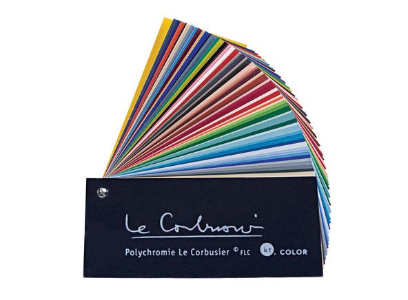
amazing article by alice rawsthorn in the new york times about le corbusier’s wall colors, must read here, a couple of lines for lazies:
“by 1931, le corbusier had settled on a palette of soft pastels and brights to accentuate white, and arranged for them to be reproduced on wallpaper swatches by the swiss manufacturer salubra. esver the control freak, he specified exactly ho salubra should group the colors together to indicate which ones could be combined.”
…
“a book of all of the swatches made for corbusier by salubra from 1931 to 1959 was published by birkhäuser in 1997. a young chemist, katrin trautwein, the co-founder of kt color, then started to explore the possibility of manufacturing the paints and secured a license to do so from the fondation le corbusier.”
by ar+pp.