fashion
model Iris Strubegger by photographer barnaby roper

thomsen – french style
i’m sorry, it is not because i’m french and somehow chauvinist but really, french brand thomsen actually nailed the plaid/liberty shirt. when every US brands are coming over and over with the same plaid shirt that feel right out of the williamsburg salvation army ( sometime even with a $300 price tag).
those frenchies achieved doing it their own way giving it a nice “cacharel/mai ’68” look rather than a lumberjack feel. on top of that, the campaigns features some of our nicest roosters and the blog is really cool. cocorico! by pp.
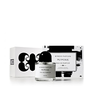
byredo – m/m
edward hopper a go-go


green as envy: supreme management SS2011 show package
the modeling agency supreme management in new york has gone through some major changes recently. under the new direction of caroline poznanski (formerly at ford models and next) they are aiming to carve the new look away from the old guard (genius man, paul rowland see our post on his photographs). to set the tone, they just released their latest show package for the SS2011, under the creative direction of new york agency ceft and company. the cards arrived in a cloth bound white box and double sided extra thick satin ribbon. inside, is a hand full of their best girls well edited and in glorious black and white. quite a shift from their old packages.


paul rowland – lady’s man photographer
just saw an article in the new york times about the man. beside the fact that someone in love with morocco can only be great, i really like his pictures.
so, photography is only a “pet project” for this paul rowland since he’s the man behind model managements such as women, supreme and lately ford.
one might get bored of everybody wanting to be a photographer these day, but sometime it’s just fine. by pp.
well miss corinne day
givenchy couture fall 2010 – yum!

juergen teller – all around
i like fashion but sometimes those guys are a bit out of it.
was checking some magazines at the store today ( can’t remember the mag) and there were actually three ads shot by photographer juergen teller back to back… i mean i love mister teller’s work but he has this particular touch that makes him the bad client to shoot several campaigns the same season… so celine, vivienne westwood and marc jacobs one after the other is stupid but if on top of that you ad that they’re all using a white frame then it’s really to much!
couldn’t find the correct ads to illustrate the post but seriously… by pp.
CÉLINE / simple leather.
man about town – gem magazine
bought the magazine man about town (sorry couldn’t find a website to link to) yesterday after everyone told me about it, and i have to say that is one of the nicest piece of stack printed paper i’ve seen in a long time. it’s beautifully designed by the great french guys at “atelier franck durand” and it is put together by ex-numero philippe utz. only great articles, genius contributors, killer look, daring interviews, nice printing… is that enough?
feel like a bowl of fresh air in the sea of sameness that is the fashion mag business.
even the fashion stories are great, which is really difficult for men. on top of that, cocorico, this numero is about… paris! lovely! dd, let me tell you that you will die for this mag. by pp’
 a visual collective outlet of inspiration


