 a visual collective outlet of inspiration
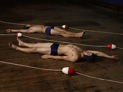
from excercise at home by luke smalley. by kl
from excercise at home by luke smalley. by kl
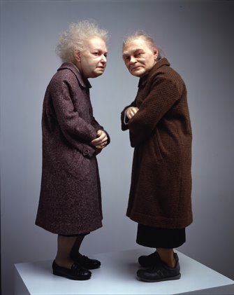
Two Women, 2005. Mixed media, 33 1/2 x 18 7/8 x 15 in. (85.1 x 47.9 x 38.1 cm).

Big Man, 2000. Mixed media, 80 x 47 1/2 x 80 1/2 in. (203.2 x 120.7 x 204.5 cm).

In Bed, 2005. Mixed media, 63 3/4 x 255 7/8 x 155 1/2 in. (161.9 x 649.9 x 395 cm).
known for his extraordinarily lifelike renderings of his subjects, (five of which were commissioned by the fondation cartier pour l’art contemporain in paris), ron mueck was the artist that I first saw in 2005 at the sensation exhibit in london (and then again in brooklyn). the pieces are made of “mixed media”, appear to be of wax and real hair. every detail is so vivid its almost unbelievable. the skin seems transparent and the hair, each individually set in, seem hyper real. one peice commemorating the death of mueck’s father via a smaller than life-size sculpture (not pictured here) has a reality inline with that of the hyper realist painters of the days past. the work is surely worth a look. by dd

the signed cover by mark for us to keep… ahhh! we love mark.
at a dinner at mark’s house, we stumbled into none other but the mother of god ms. bjork and her football player, film maker, artist from trustafarian school yale, mister matthew barney. of course no one noticed!
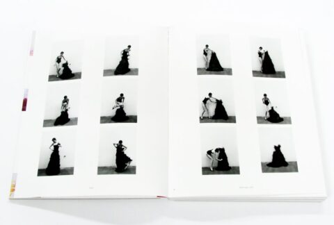

another dreamer we love to love. by kl
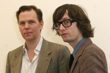
ok this blog is now officially about jarvis and karl. that’s it… picture taken in the penthouse suite on the night of the opening of the holiday-inn in chelsea this last november… oh yes, and the guy next to him is mr. john (harold) currin (he’s known to be an artist of sorts). by dd
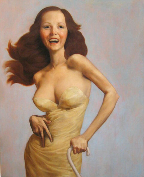
anime meets helmut newton – the cripple sexy psycho. i was never a big fan of john currin, i liked some of his pieces on a purely aesthetic level, but i never got what the work was about and i suppose it didn’t effect me enough to ever bothered to find out. as a decorative piece they can be nice, i mean they will surely match someones couch, some where. but as a whole they seemed stupid and frivolous. the one element that captured my attention for a few days at the start was the fact that he was painting rather traditional subjects/portraits in oil on canvas in a time like this? meaning now! it seemed so lame and out of touch, but then again I liked his retaliation towards the scene. the fad, the press, the marc jacobs obsession, etc made him the bad boy or the hot boy and one couldn’t get away from him. after a series of portraits of his wife, Rachel Feinstein, he moved on to graphic sex scenes of people I could not recognize. made me yawn to be honest! flash to years later, the other night I had dinner with sabrina buell from matthew marks gallery in new york and over the course of our dinner she said something that i liked. she said “currins work was quite so about our time, the excess and the gaudiness… the women in his work didn’t just have breasts they had gaigantic breasts, it was about excess…” ok thats not bad, how could i have missed it. sure enough there are plenty of that in his work but i still dont see the thread through the work. i’m still not convinced of his work but it was a point to consider. by dd


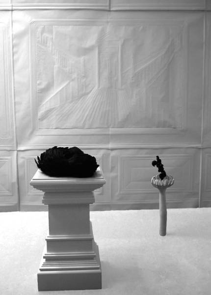
work about perspective has become more popular in the past few years, i think especially as we now have digital abilities experiencing the same effect in real space brings true amazement to precision. i couldn’t find much about bernard voita except that he is swiss, born in 1960. i’m guessing his work has inspired popular artists such as felice varini and the like. by kl

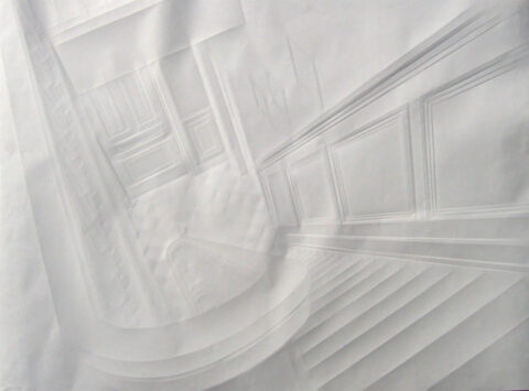

its amazing what a little pressure can create. these are works done by folding and scoring by german artist simon schubert, and can be seen in berlin at upstairs berlin. by kl
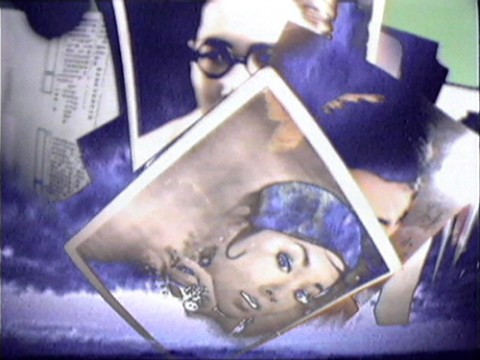
i’m a bit over it, but i loved it when i first heard it. if you have never heard this cover,be patient at least until you get to 3:15: …that’s when things get interesting. performed by swiss born nutcase/celebrated artist pipilotti rist with many thanx to our pp for his enlightenment. by dd
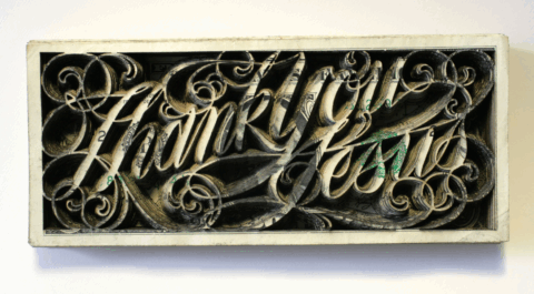

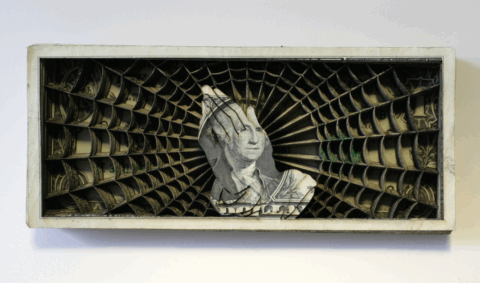
scott campbell is generally best known for the tattoos he is drawing on celebrities and nyc hipsters (we think about marc jacob’s sponge bob or dash snow’s “eat shit & die”). but here, beside the precision and the meticulosity of those -i guess- razor blades cutt-outs, it’s the support that is interesting. maybe it’s a way to tell us that his customers represent a stack of bills to him 😉 like it! by pp’
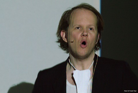
i was introduced to egill sæbjörnsson on a trip to reykjavik iceland where I got a cd performance of this artist (who also sometimes sings), from bad taste records (Smekkleysa) the owner Einar Örn Benediktsson (of the sugarcubes) the album was titled “tonk of the town.” great set of tracks if you can find a copy. egill plays all instruments and sings on the album, the low-tech production work is key, and the content is rather whimsical and easy. it is a breath of fresh air in the world of the ‘too cool for school’ art industry. the lyrics are literally grabbed from the air, words he heard at a bar, lyrics to a song he thought was thin lizzy but later found out otherwise… this piece posted here, is more of a performance piece than a song, so don’t mix the two mediums. i simply cant find anything on him, but felt he deserved a spot on tomorrow started, so don’t just take my word for it, look it up for yourself: egill sæbjörnsson “tonk of the town”. by dd