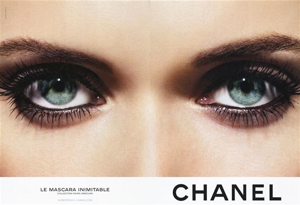

for the record, aside the early lancôme campaigns approx 3 years ago, these are some of the most beautiful cosmetic advert ever. polish model malgosia (actually malgorzata) bela photographed by norwegian photographer solve sunsabo. i remember when i first saw one in a publication, it just stunned me. i stopped and had to take notice. it was quietly screaming and making me want something… i’m still wondering what that was. by dd
fendi flairs up

a lovely pic by photographer karine basilio, the work that i saw was not consistent but there are a few beautiful images that show that she has it in her. more of this would be good. by dd
Its not always bad to see double: models Alice and Caroline


models, alice and her sister caroline

met alice today, super lovely girl, tall as a tree and full of energy. she made our day at the office. thanx alice and watch out for all the rabbits in new york city. they are always late, always late, for a very important date!! by kl
rather uncommon: common projects made in italy

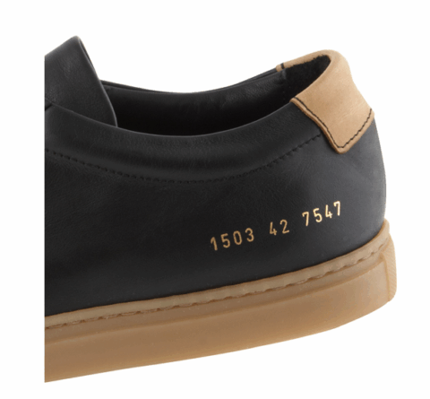

bit pricy for a pair of sneaks but i’m drooling over it none-the-less. tan sole, italian nappa leather upper, rubber sole, made in italy. $375 USD. available at odin nyc. by dd
How to make bacon at home


no animals were harmed in creation of this post, by dd
a note worth noting: you locked me in!?
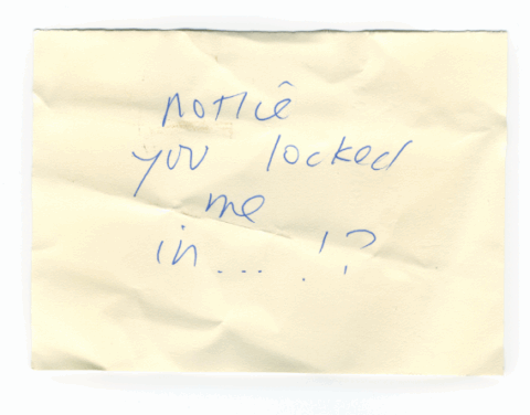
just regrouped with the rest of the tomorrow started clan and when i returned to my bike i found this piece of paper slipped to my chain…. so sorry!.. who ever you are, i love your note, maybe i will do that on purpose next time to get another one of those! I have to thank dd for making me post it, now i will collect them all and will be forever grateful of my dd by pp
city biking: fold it up

my bike was stabbed last week. I think it might be about time to get a foldable one that I can carry up my six flights of stairs and hide under my bed. I quite like this one by areaware.
by sv
smoking is bad: but this is not
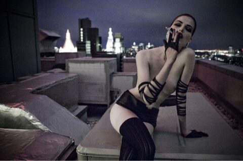
nice one by photographer karine basilio by dd
heading to Mauritius: from up above


 wish you were here. by kc
Prada logo treatment: follow me to hell

nop! this package and its logo placement was not the result of some chinese quality control

the double logo and the label appears to be an afterthought. really?
so what does a luxury brand like prada do when everyone’s trying to be lux? seeing the latest logo treatments at the parda store made me wonder for a bit… i saw a random half cut logo on the cap of some cosmetic pack, the fragrance box with the double logo on the box, one covering the other… like someone saying their name twice upon introduction. the first name quietly and muffled and the second, bold and pronounced. this of course is a major no no in design, but with fashion in general anything goes, all bets are off. they even make wallpaper patterns out of their logos (i bet that made the marketing directors excited), i cant help but equate such behavior with one of those tacky celeb PR shots infront of some logo plastered wall for some vodka of the day, after all that’s the real purpose, so lets not be shy. but this is not always the case with madam prada. not only the double logo is there for no good reason, they took great pains to design it as thought it was haphazardly placed over the second, or even better, just casually running off the cap. like one of those “i just woke-up” haircuts that took hours to do. but to their credit what else could prada do? whatever prada does is knocked off within weeks, i mean every monkey now has a perfume with one of those ‘squeezable testicles’ that prada reintroduced… maybe this is the latest way to separate yourself and say… ok you wanna follow/copy me? go right ahead… i’m jumping out the window. by dd
socialisme : by Jean-Luc Godard (2010)

why has no one been talking about jean-luc godard‘s new film socialisme? it screened at the recent cannes film festival and described as his most recent ‘avant meditation’. looking forward to something more dimensional to cross the pond into a theater near me. i’ll have more to share once i’ve seen it myself, but from what i’ve read here (and with godard being described as stan brakhage crossed with noam chomsky), there are some explorations in the film that will be interesting to be brought into the conversation. by kl
 — see more of this on tomorrow started blog)
the black belles – worshipping paul

i’m not sure why, but i think these girls are obsessed with paul from gretchen. except girls, all black and furry hats… a little fineness is appreciated. this is the first single by the black belles, it’s called what can i do? and directed by jack white… you know where he’s from, right? by kl