tomorrow started
terence koh loves and loved by converse

pierre hardy + hermes
Bas Jan Ader : PITFALL ON THE WAY TO A NEW NEO-PLASTICISM

establishing in the 1910’s, the original neoplasticists were piet mondrian and theo van doesburg. they believed that the only absolutes of life were vertical and horizontal lines and the primary colors. to this end neoplasticists only used planar elements and the colors red, yellow, and blue. thank goodness this perspective evolved off of the canvas, and surely brought us conceptual art. by kl
Natacha dzikowski and her boys
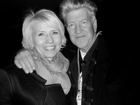
 natacha dzikowski and david lynch
 natacha dzikowski and olivier zahm
 natacha dzikowski and ucef hanjani
will be hard to top this one… 2 out of 3 ‘aint that bad… but what can you expect from one of the most amazing women east of manhattan? by xy
simon hasan – boiled leather

if you have a chance, check the hand-made issue of wallpaper magazine that features a story on him re-doing a poltrona frau seat his way, super interesting (as is this all issue) by pp’
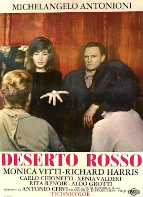
deserto rosso 1964: michalengelo antonioni
by dd
Michelangelo Antonioni’s red desert with monica vitti
 a troubled monica vitti with british actor richard harris who walked out on antonioni after asking antonioni “why am i walking across the field?” to which antonioni replied “you’re an actor, you don’t question me, you do what i tell you to do”
 entire streets, grass fields and buildings were painted to achieve the color
 the criterion collection which is only $31.96 (on sale now) includes;
audio commentary by italian film scholar david forgacs (this is quite nice), archival video interviews with michelangelo antonioni and monica vitti and a booklet featuring an essay by film historian mark le fanu, an interview with antonioni by jean-luc godard, and a reprinted essay by antonioni on his use of color plus the usual other crap on such discs. with many thanx to cdc. by dd
YUK! V magazine cover: the sexy body issue with adriana lima
we know that times are desperate, we get that bomb-shell curves are back in (granted not by choice rather by necessity of our western obesity), but can someone please explain what v magazine is doing/thinking. absolutely crass, mundane and uninteresting series of covers. you can add this to the bang ad by marc jacobs (see post). seems like crass/kitsch taste is quite back in fashion. quite happy to be well outside of it. by dd
Robert Duffy, marc jacobs president, stares down a damn camel in cairo
PURPLE NIGHT
i would personally never buy a magazine featuring mister zahm’s night accomplishments but i have to admit that their art director (gianni oprandi) is really on top of it as usual! by pp’
more mary frey! imagining fauna
some more super nice work from mary frey! see previous post if you haven’t by pp’
 a visual collective outlet of inspiration


