 a visual collective outlet of inspiration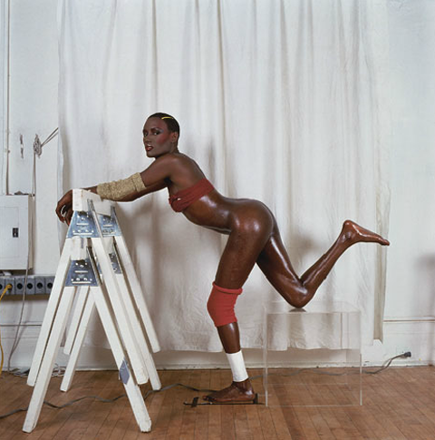
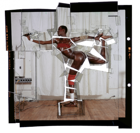

more goude, here the “pre-photoshop” steps of goude’s famous pictures for the cover of grace jones’s island life record. all of these with a pair of scissors and a brush… lovely! by pp.
more goude, here the “pre-photoshop” steps of goude’s famous pictures for the cover of grace jones’s island life record. all of these with a pair of scissors and a brush… lovely! by pp.

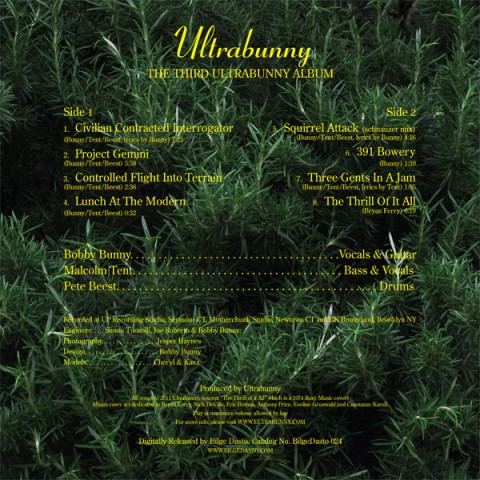
free download of the album for a limited time starting october13. made in connecticut, USA. see ultra bunny live in brooklyn this sat the 13th. rock on bunny. by xy
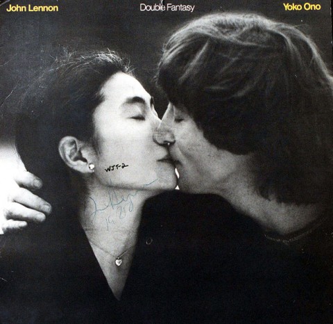 might be the ultimate john lennon memorabilia… the disc is the one his murderer had lennon sign a few hours before he took action. sad. by pp.
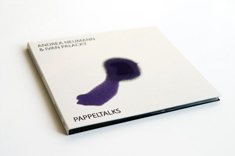
interactive cd cover designed by checz studio: Hubero Kororo in which after opening (tearing off the seal), the outer minimalistic graphic of the snow-white package is irretrievably disturbed by a stain, which turns to the colour of the inner content. by cp
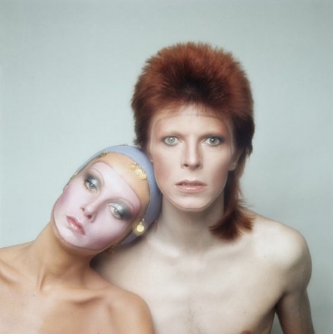 “I remember distinctly that I’d got it with the first shot. It was too good to be true. When I showed Bowie the test Polaroids, he asked if he could use it for the Pin Ups record sleeve.
I said: “I don’t think so, since this is for Vogue. How many albums do you think you will sell?”
“A million,” he replied.
“This is your next album cover!” I said.
When I got back to London and told Vogue, they never spoke to me again. Several weeks later, Twigs and I were driving along Sunset Boulevard and we passed a 60ft billboard of the picture. I knew I had made the right decision.”
Justin de villeneuve on the picture he made that ended up being the cover of bowie’s “pin ups”. the entire story here by pp+tg.
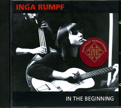
time for some german rock! here’s inga rumpf (beim deutschen schlager-wettbewerb) in berlin in 1968. if you don’t know her, you can look up the city preachers her original band. this album under her name, is really great especially the cover of waterboy and i’m on my way. not sure how i ended up buying it but i’m glad i did. for my dear friend frank. danke. by dd
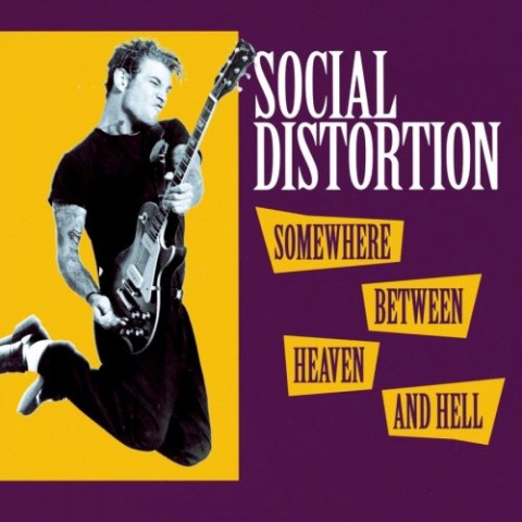 by jr
by jr
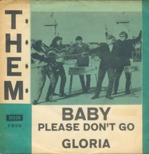
the unrecognized stones… thanx hd. ‘baby please don’t go’ performed by them, featuring van morrison. by dd

released 11 august 2010 on cool runnings, a bit guitarded but still… check out “trippin’ balls at der wienerschnitzel“. by xy
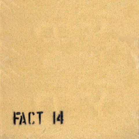
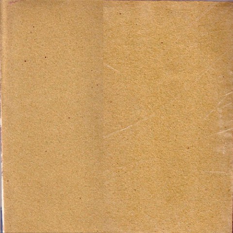 made of sand paper, and guaranteed to grind away the other crap albums in your record collection.
durutti column was actually one the few bands that came out of factory that was less pop driven, and is still quite listenable to today. the album covers as expected, were different. the fact 14 durutti column cover was made of sand paper, and limited to 2,000 initial copies. funny enough, the covers were hand assembled by joy division’s ian curtis. who, at the time, needed the extra cash making for an even more special object. the design credit is generally given to peter saville and tony wilson, but apparently steve horsfall had a good thing or two to do with it. again, as all ideas go, who knows in this case whether the use of an abrasive sand paper is really the great idea for a band that was different enough to aim to grind away all your other crappy albums of the time. i personally love it and it’s one of my favorite covers of that time. by uh
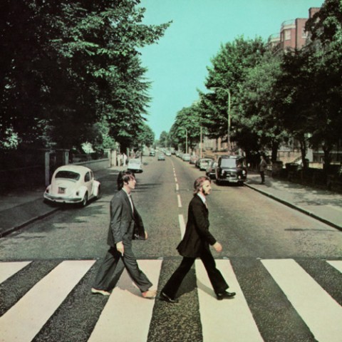
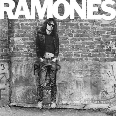
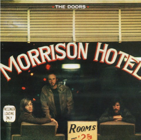
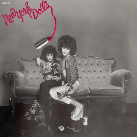 i remember seeing this series a while ago at palais de tokyo in paris and thinking it was quite interesting. hatim el hihi and jean-marie delbes made these images by retouching out the dead people from famous record covers. here are the most famous but there is lots of others equally nice here by pp.

hanging duck always beats a sitting one. by dd


