

with the aim to explore the relationship between artists and nature, each one of these six scents are meant to remind us that we should preserve nature so it can continue to inspire the art and design industries. designers phillip lim, damir doma, henrik vibskov, henry holland, richard nicoll and toga collaborated with different perfumers like louise turner and stephen nielsen. available at seven in new york. by xy
design
philips de pury’s latin american art exhibit
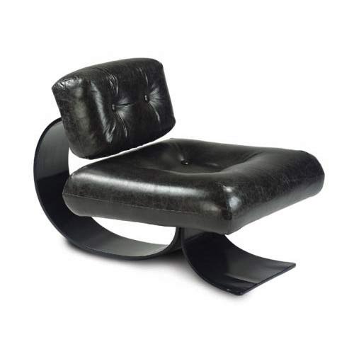
below: oscar niemeyers chair and ottoman in bent rosewood as yves would say its “ravishing’
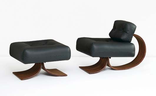
earlier tonight, at the opening of philips de pury’s latin american art exhibit in new york, there where three peices that were desperately begging to come home with me. one was oscar niemeyers chair and ottoman in rosewood (auctioned at: 15-20K), the other was a candida hofer photograph of the library in buenos aires, colegio nacional de buenos aires (auctioned at: 60-80K) and the last darling was a jorge pardo, untitled #6 (auctioned at: 25-35K). as i already have a jorge pardo i had to skip that one, the niemeyer for sure would have required a larger new york apartment and that is not currently an option, the hofer on the other hand (of course the biggest of the three bites) just wouldn’t give up on me…. but what can i say, times are tough for art. be sure to at least check it out. by uh
puma PT3 accessories
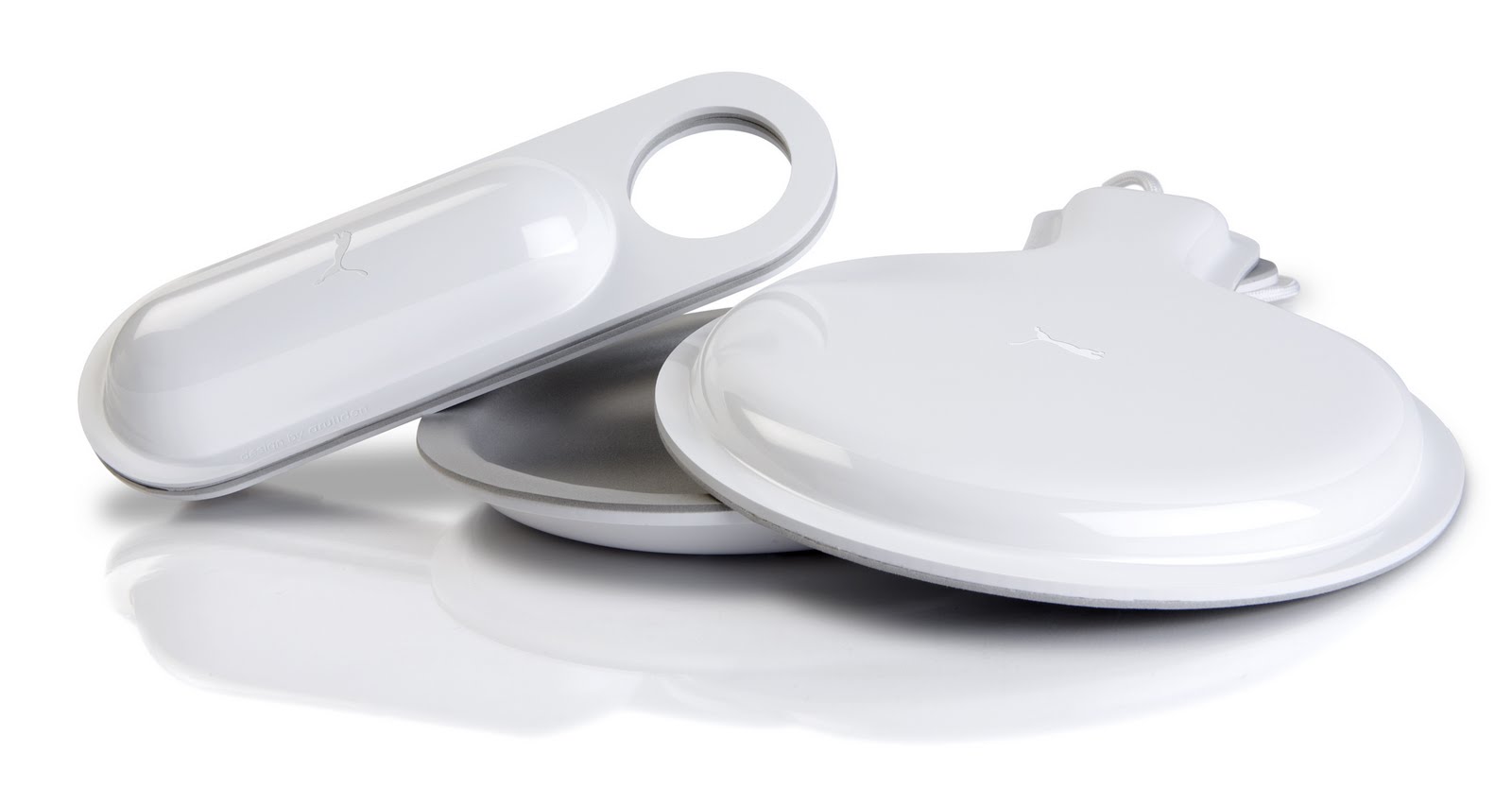
just a few kung-fu moves, and you’ll be set to rock the casbah with this ping pong carry on… PT3 (Puma table tennis tournament) was conceived and based on a simple idea: to bring a community together for the sheer passion of table tennis, more affectionately known as ping-pong. but the beloved sport with a loyal fan club had no accessories. so aruliden designed and developed the ultra-magnetic paddle and ball case for PUMA. no more zippers, buttons, hard to close mechanisms. simply magnets. we have a set and nothing has been the same since. not even ping pong. by dd
yoko ono for that’s shanghai
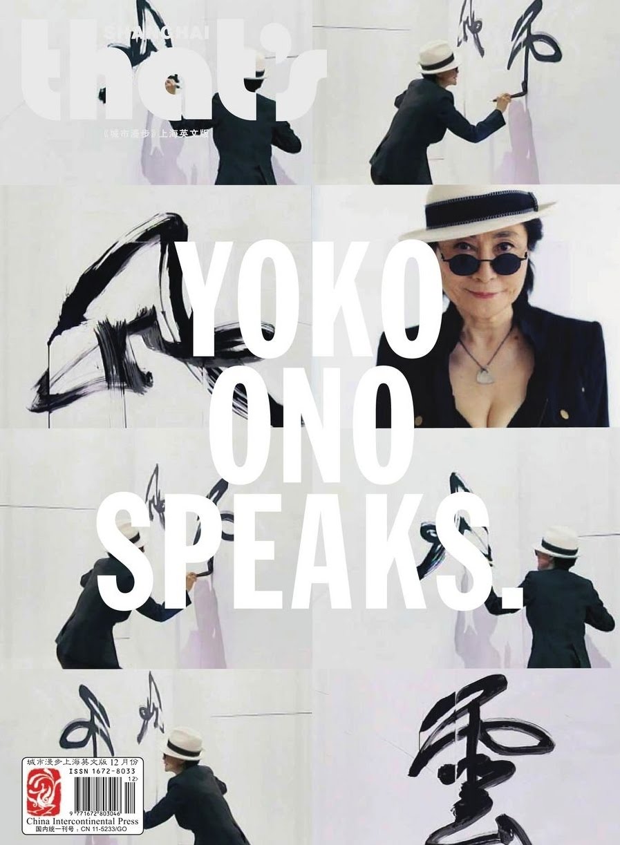
nice cover. courtesy of china international press. by dd
boffi kitchen
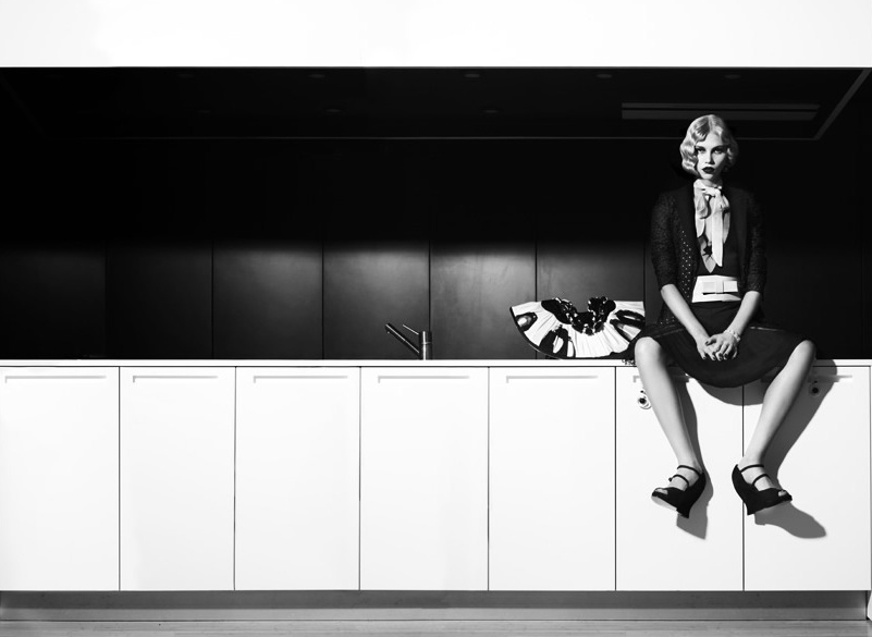
boffi kitchens have a way with cooks and pretty women… cooks seem to hate it, but pretty girls can’t seem to resist it! photo by laurent darmon. by xy
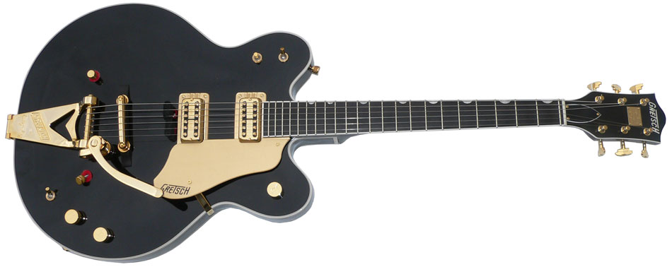
gretsch: collect them all
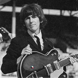
george harrison’s gretsch
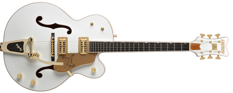
2 semi hollow’s with f-holes – above the gretsch white falcon
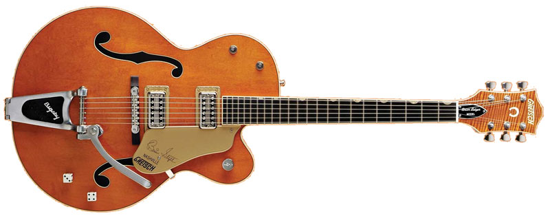
three versions of the gretsch guitar including the über fancy white falcon. by dd
the latest Bosendorfer grand piano

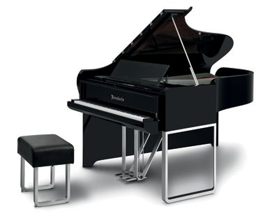
certain things… you just don’t mess with. like the shape of a grand piano. they all bear the same shape for a good reason, because the shape was not meant as design but for its acoustic function. that said audi has “broken the rules”… (wow, so punk to do that?), with it’s design for the bosendorfer piano’s 100 year ear mark with this contraption which appears to simply drape an old shape.
the piano is available for an approximate $140,000 and we can somehow rest assured that bosendorfer will not make anything short of amazing sounding objects. that said we’ll have to wait to hear the real auditions… had he been alive, i would have loved to see glenn gould’s reaction to this one… by dd
help! I’ve cut myself: the apple of pharmaceuticals
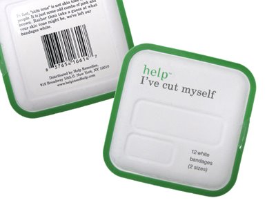
“help remedies” which is offered on virgin america, and local NYC rickeys, amongst other places, is the apple computers of all pharmaceuticals. the packaging containing a variety of remedies such as headache medicine, sleep issues, etc seems bio-degradable enough. it is made of molded paper pulp and a bio plastic made primarily of corn. unfortunately it still uses the same old blister packs inside (non bio-degradable). it gets a A for design and B for total earth friendlyness. bringing its GPA to a B+ … well its still better than the D- of Beyers and the rest. support them if you can find em. by dd
Porteur bike by Ateliers d’Embellie
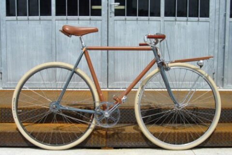
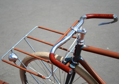
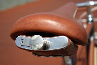
ateliers d’embellie’s portuer bicycle has been released, bringing to us a truly unique masterpiece. the bike’s entirely handmade with vintage NOS parts and high quality leather and mixes leather craft, street fashion and luxury. the color scheme is a classic vintage grey, highlighted with brown leather, chrome and copper touches. i particularly love the flask clip under the seat. by kl
Faust Vinyl
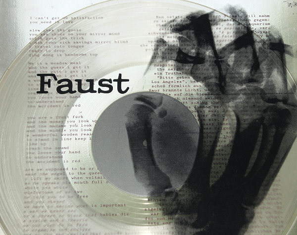
faust’s first album 1971, surely a collectors item now, was originally printed on clear vinyl in a clear sleeve with a silk screen of an x-ray of a human fist on the sleeve. very cool to have clear vinyl especially for the time. by dd
Kenzo/Hakkin: what do you know?
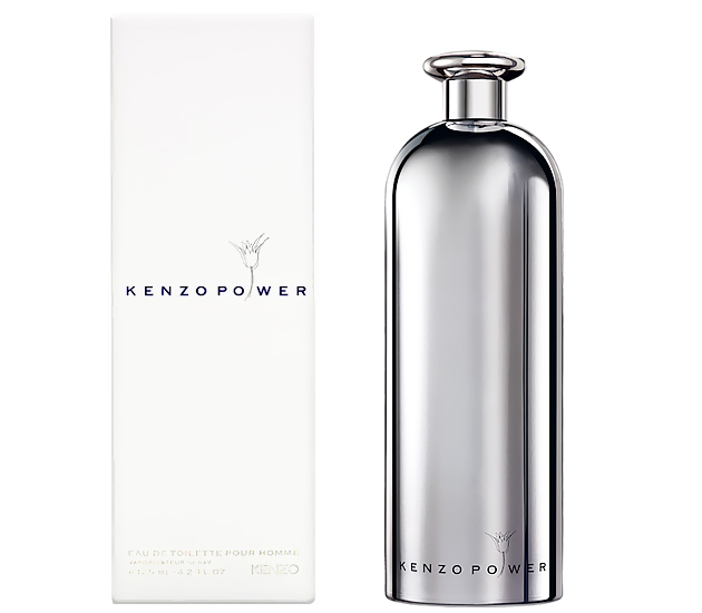

the new perfume from kenzo, i discovered, was designed by japanese designer kenya hara. hara indeed used a bottle he had previously designed for hakkin sake as a basis for this. he describes the process of designing the bottle, and i must say i relate to so much of what he says:
“i designed a very simple bottle for sake called hakkin. and i realized what i was expected to do here. what i had in my mind may have been an image of design for 720ml. by changing the size, the liquor bottle can become that of perfume or vice versa without altering the shape or design.
“the bottle was beginning to form its shape but we then needed to work on the package. perfume is usually displayed on the shelf in accumulated manner so the boxes needed some creativity without over doing them. after consideration, we decided to make the box with a slight angle of inclination toward the top. by doing so, there creates some space for lights to come in from above when the boxes are displayed together. this very minor change created a tremendous effect to the box and the display, i persuaded strongly to use this idea for the box. It actually turned out to be a bit difficult to make this box with inclination but it came out nicely at the end thanks to the package manufacturer’s efforts. the package may look simply plain, but we carefully planned every detail such as paper which was chosen by its touch and texture. for the paper, we decided to use something with special features which i created in the past. this paper is unique in a way that letters become dented and semitransparent after printing. we wanted to use this paper for the box and found something of similarity in european market.”
“kenzo is a brand of colors, but i only use colors when necessary because i am a designer of “emptiness”. of course i use colors as communication method such as using red for fire extinguisher or for essential buttons on machines, but i minimize the usage as much as possible for other purposes such as design. if i am to use metal, i will use its original metallic color. when using the glass, paper or whatever the material would be, i will use their original colors. upon printing words on the product, t will use black prints without any question. as I am always piling up simple ideas as such for my designs, the design that i presented for this project too was not colorful.” by dd
øya festival’s club night
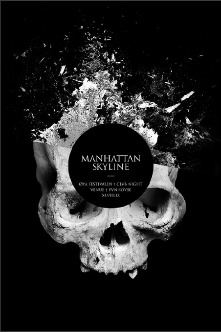
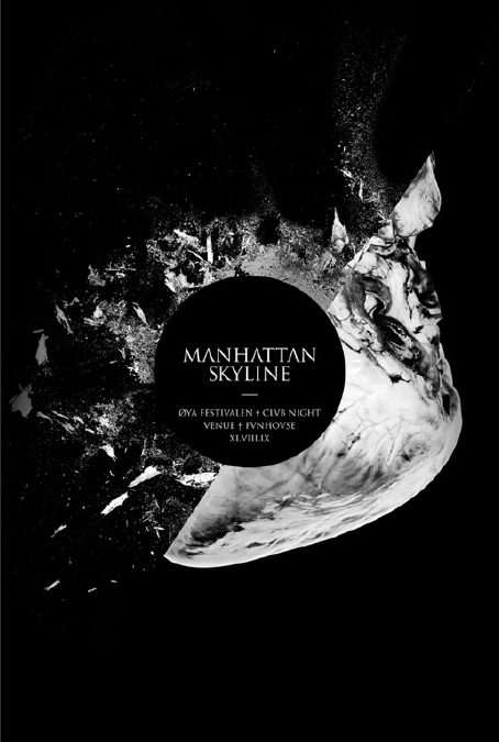
posters for the øya festival’s club night. mind-blowing stuff!by kv