actually that was a very fun shindig indeed. DS was pleasantly surprised after this feed, the pay-bar was a bit odd, must admit, but in hindsight that’s cool and rather in-order given the state of the economy and an exclusive start-up like house of waris. that said we had a blast and the crowd was, as expected, good. the place was comfortably packed without the insanity associated to the past marc parties where you literally can not walk let alone dance. leaving at 1am there was still a heard of people at the door slithering to get in. if anyone was to criticize anything it was the music. the best music yet was at the roof-top for the visionaire + women management party. still waiting to get the track lists on that. by dd
perfect lovers: felix gonzales torres vs. tobias wong
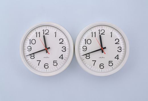
the original “perfect lovers” by felix gonzalez-torres, 1991. these two identical, adjacent and battery-operated clocks were initially set to the same time; but, within time, they will inevitably fall out of sync. so true.
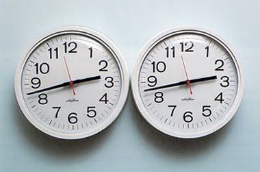
‘perfect lovers’ by tobias wong. two commercial clocks outfitted with atomic radio receivers which automatically synchronize to the U.S. atomic clock and tells time accurate to 1 second every million years.
it’s funny, just yesterday we were speaking about tobias wong. a love/hate discussion, as one can imagine. in the end, we do love his work, and his ‘devil may care’ attitude in a sea of self-obsessed and self-serious artists and designers. the two works may appear the same, they even bear the same title; however, i can’t say that wong has stolen anything here as the “idea” is altered which is far superior than the form. in his own way, he is crushing the romantic notion of felix gonzalez-torres, where the clocks/lovers sadly fall apart in time. tobias’ version flexes its middle finger to all that is sentimental and romantic in the coldest and most rational way of all… the atomic clock. as KL suggested maybe he’s testing our knowledge? he could have credited felix gonzalez-torres for the inspiration… but that would be contrary to this icy-cold-world idea. by dd + kl
Lagavulin 21 Year Old Single Malt
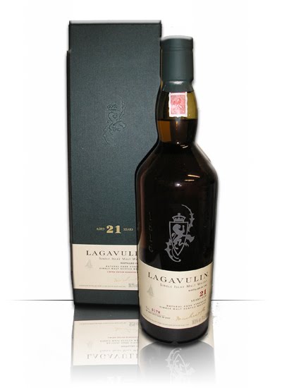
one of my favorite drinks is the lagavulin single malt. the 12 and 16 year old are amazing and less contemplative; however, the 21 year old will require some thinking if not on the complexity of its aroma, then on its price… it is not an everyday whiskey, as the taste and aroma are quite distinctive. that said on certain nights, it is a rather necessary item. the aroma is smokey as in most islay malts but lagavulin has the strongest peat flavor of all. its dry, complex, notes of sea-spray-from the island no doubt, are perfectly matched by the slightly sweet accents of sun-dried grapes (derived from pedro ximenez cask-wood in which this special edition has been double matured in). its really a drink to ponder on and get lost in…
56.5% natural cask strength, one of only 6642 bottles, distilled in 85 bottled in 2007. available for $662 making it a rather special gift. by uh
yoko ono for that’s shanghai
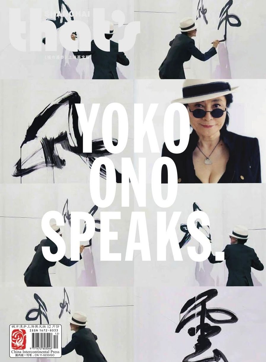
nice cover. courtesy of china international press. by dd
iconoclastic: yoko ono and three as four at milk tonight
quite a nice invite, i must admit.
iconoclastic invitation for the “three as four yoko ono 2010” show taking place tonight at milk studios NYC. performance starting at 7:00 pm. invite only.
threeASFOUR + Yoko Ono

gabi at work on one of the collection’s pieces
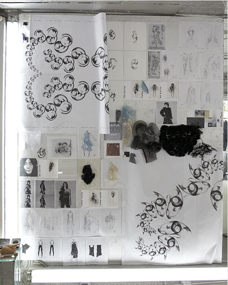
sketches, fabrics and prints
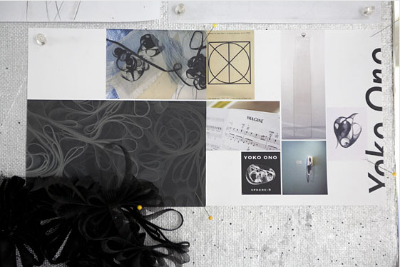
the design trio threeASfour has collaborated with yoko ono on their spring 2010 collection, which they’ll show during new york fashion week, on september 17 at milk studios. ono’s dot-drawings have been turned into limited-edition prints on cotton and silk and i just can’t wait to see the result. the event will also include a preview of yoko ono’s new album, “between my head and the sky”. by kv
DASHWOOD bookstore
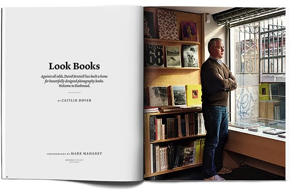
opened a few years ago and still standing there is a little bookstore on bond street. tailored with a collection of contemporary photography dashwood is a great bookstore to visit. it is located on bond street (between lafayette and bowery) in new york. by dd
phoenix – banque de france
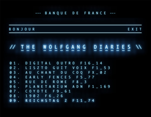
following the post on phoenix’s super cool album,here is another very cool hidden website of them them. hear some special tracks and hidden songs. “BANQUE DE FRANCE” to access, login: CONCORDE by pp’
ecofont, a must save
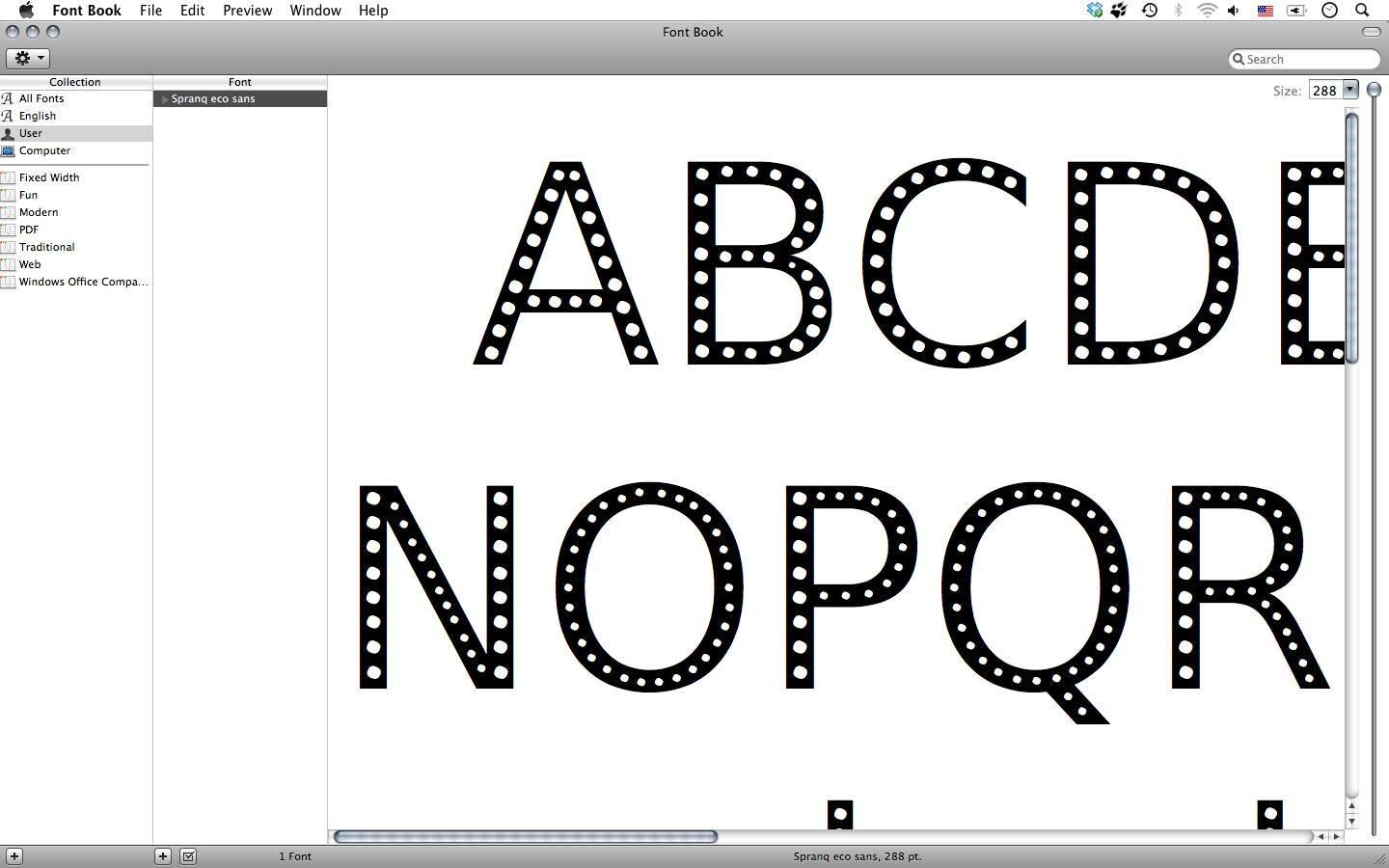
ecofont the prints we make for our ‘daily use’ not only use paper, but also ink. according to SPRANQ creative communications (utrecht, the netherlands) your ink cartridges (or toner) could last longer. SPRANQ has therefore developed a new font: the ecofont. “after dutch holey cheese, there now is a dutch font with holes as well.” appealing ideas are often simple: how much of a letter can be removed while maintaining readability? after extensive testing with all kinds of shapes, the best results were achieved using small circles. after lots of late hours (and coffee) this resulted in a font that uses up to 20% less ink. free to download, free to use. to download here by pp’
go asics pro

asics previous released pro court boots still rock if you can get your hands on the all white ones. by dd
Gretsch fever: rebels rule

stray cats runaway boys – official early video
stray cats rebels rule studio recording. by dd
more black and blue than purple: Olivier Zahm

such a ladies man you are… grrrr!

and your poor girlfriend…

and by the way who posts a picture of themselves like this on their blog?
there is something about french cheese i learned when i lived in paris… just cause it stinks it doesn’t mean it’s good. as much as olivier aspires to be like serge, zahm is more in line with the late belmondo and aged delon than anywhere near gainsbourg. but one can always keep trying. as terry advised me once, “rock out with your cock out”. now just for the record, we have nothing against purple the magazine, we do like it, we have the very first issues when it was in a smaller format and not plastered with nudies. in terms of publication we even like the more recent ones, but some things have to be said about a man in a position of power who uses it shamelessly… which by the way brings to mind, that short italian prime minister, is that berlusconi? by dd