

 when she’s not styling a.p.c campaigns, or flashing her tits to mr zahm or stabbing jarvis’ heart, stylist camille bidault is making lovely pictures. her first story was published on the web version of another mag. although i’m generally tired of those crossing over various carriers, actors singing, models acting and so on, i must admit that there is something really fresh and appealing in miss bidault’s photographs. hopefully there will be more to come! by pp’
fashion
Look what kevin’s upto: mohawk general store opens in echo park CA

 kevin carney, the generic man, at his new mohawk general store
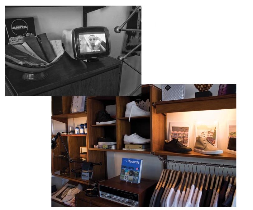 i still have kevin’s old stuff from way back… from the generic costume days in NY and i just cant stop using em. we run into kevin here and there and he has constantly kept up a good show, from his footwear designs to little stories that pop-up on his shirts and jackets. his latest move, mohawk general store, in echo park CA, has three-quarters of the it’s goods made locally, and many of the products are recycled, including his label, generic man boots that are made from recycled rain coats $390. by cc
all about kate
 you could put the girl into art, but you can’t put the art into the girl… or something like that. by uu
chanel cosmetic adverts: malgosia bela photographed by solve sunsbo


for the record, aside the early lancôme campaigns approx 3 years ago, these are some of the most beautiful cosmetic advert ever. polish model malgosia (actually malgorzata) bela photographed by norwegian photographer solve sunsabo. i remember when i first saw one in a publication, it just stunned me. i stopped and had to take notice. it was quietly screaming and making me want something… i’m still wondering what that was. by dd
fendi flairs up
 a lovely pic by photographer karine basilio, the work that i saw was not consistent but there are a few beautiful images that show that she has it in her. more of this would be good. by dd
Its not always bad to see double: models Alice and Caroline

 models, alice and her sister caroline
 met alice today, super lovely girl, tall as a tree and full of energy. she made our day at the office. thanx alice and watch out for all the rabbits in new york city. they are always late, always late, for a very important date!! by kl
How to make bacon at home


 no animals were harmed in creation of this post, by dd
smoking is bad: but this is not
 nice one by photographer karine basilio by dd
Prada logo treatment: follow me to hell

nop! this package and its logo placement was not the result of some chinese quality control
 the double logo and the label appears to be an afterthought. really?
so what does a luxury brand like prada do when everyone’s trying to be lux? seeing the latest logo treatments at the parda store made me wonder for a bit… i saw a random half cut logo on the cap of some cosmetic pack, the fragrance box with the double logo on the box, one covering the other… like someone saying their name twice upon introduction. the first name quietly and muffled and the second, bold and pronounced. this of course is a major no no in design, but with fashion in general anything goes, all bets are off. they even make wallpaper patterns out of their logos (i bet that made the marketing directors excited), i cant help but equate such behavior with one of those tacky celeb PR shots infront of some logo plastered wall for some vodka of the day, after all that’s the real purpose, so lets not be shy. but this is not always the case with madam prada. not only the double logo is there for no good reason, they took great pains to design it as thought it was haphazardly placed over the second, or even better, just casually running off the cap. like one of those “i just woke-up” haircuts that took hours to do. but to their credit what else could prada do? whatever prada does is knocked off within weeks, i mean every monkey now has a perfume with one of those ‘squeezable testicles’ that prada reintroduced… maybe this is the latest way to separate yourself and say… ok you wanna follow/copy me? go right ahead… i’m jumping out the window. by dd
man is back: freemans sporting club NYC


 from the boys that brought us freeman’s alley and that little tribeca joint, comes: “freemans sporting club (rivington between bowery & christie) was borne out of a gathering of close friends playing pool, carousing, and drinking whisky above freemans restaurant in new york city. the regular meetings led the group to organize trips to camp, shoot, fish, and enjoy time in nature outside the concrete canyons of new york.” o.k. i know it all sounds a bit pretentious, to act like you live in a cabin in the woods, with deer heads on your wall, when you actually live in new york f#@kin’ city but what the hell, i guess a mans gotta do what a mans gotta do. lets all go fish, or at least dress up like it… cause the stuff looks damn good. by dd
Lid Magazine Number 10-SS 2010: more of a book worth coming back to
 spring summer issue of lid #10
 the amazing diane lane (see our other post)
 bob fantastic train ride
 halstone at his olympic tower atelier, nyc 1979 by dustin pittman
 poet, roach killer, artist extraordinaire: mr. jim carroll
i came across this gen of a magazine the other day and i have to say it made me think about all the crappy self service issues i’ve bought. $50 for 500 pages of disposable snaps disguised in a hard cover, foil stamped, shrink wrapped gift pack, just to make you feel “you’re sooo worth it”. at least olivier zahm goes the extra mile to provide some kitty porn to compensate for the poetry hes lost. on the other hand the fellows at lid didn’t make much of a fuss. soft cover, solid black and white printing for a fraction of the cost and a mag you’d want to keep and use. the issue simply made me happy and coming back to it over and over again. well done! by dd
martin margiela (untitled)
sometimes not a fan of everything mister fabien baron is coming up with, i was highly disappointed when discovered the bottle for the first martin margiela’s fragrance “untitled”. margiela is definitely the brand i used to consider as the most interesting identity wise so when i saw this ugly green bottle with the stupid white plastic thing around i was chocked… that was until i saw the trailer above that i understood the white thing is paint and it make more sense (still not sure about the color of the juice, the baron choice, dieseland so on but that’s another story)… by pp’
 — see more of this on tomorrow started blog)