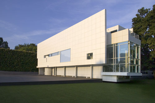
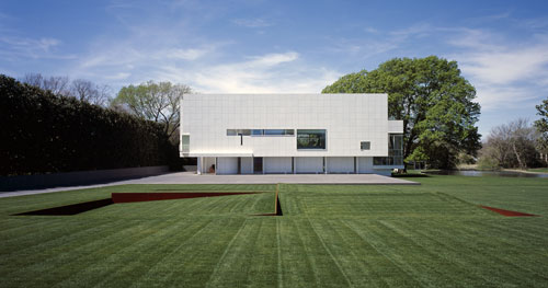
“a visit to the rachofsky house unfolds as a kind of procession through a series of zones, taking one from the outdoors to indoors, and then back outdoors again. all of the spaces of the house, works of contemporary art, and vignettes of the surrounding landscape combine to animate the interiors of the house. grass, trees, pond and sky are visible from every angle of the house.
the heart of the house is the second floor living room. secrets of the entire site are revealed through the double-height plane of windows that serve as a permeable membrane between nature and home. whereas the front façade of the house is reserved and opaque, the back façade dissolves and allows constantly changing plays of light and silhouette to amaze people within and outside the house. ultimately, the purpose of the rachofsky house is to provide a place of residence and respite. the potential of the house as a work of architecture is as a catalyst for further contemplation of nature and art, and the science of bringing them together in harmony.” richard meier by dd


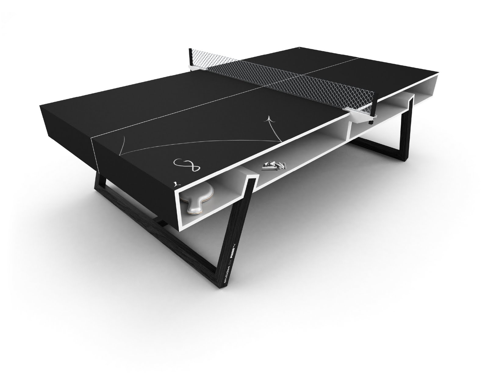
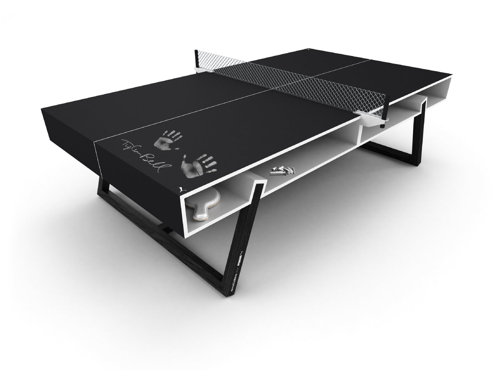
 storage plus a pair of ash legs
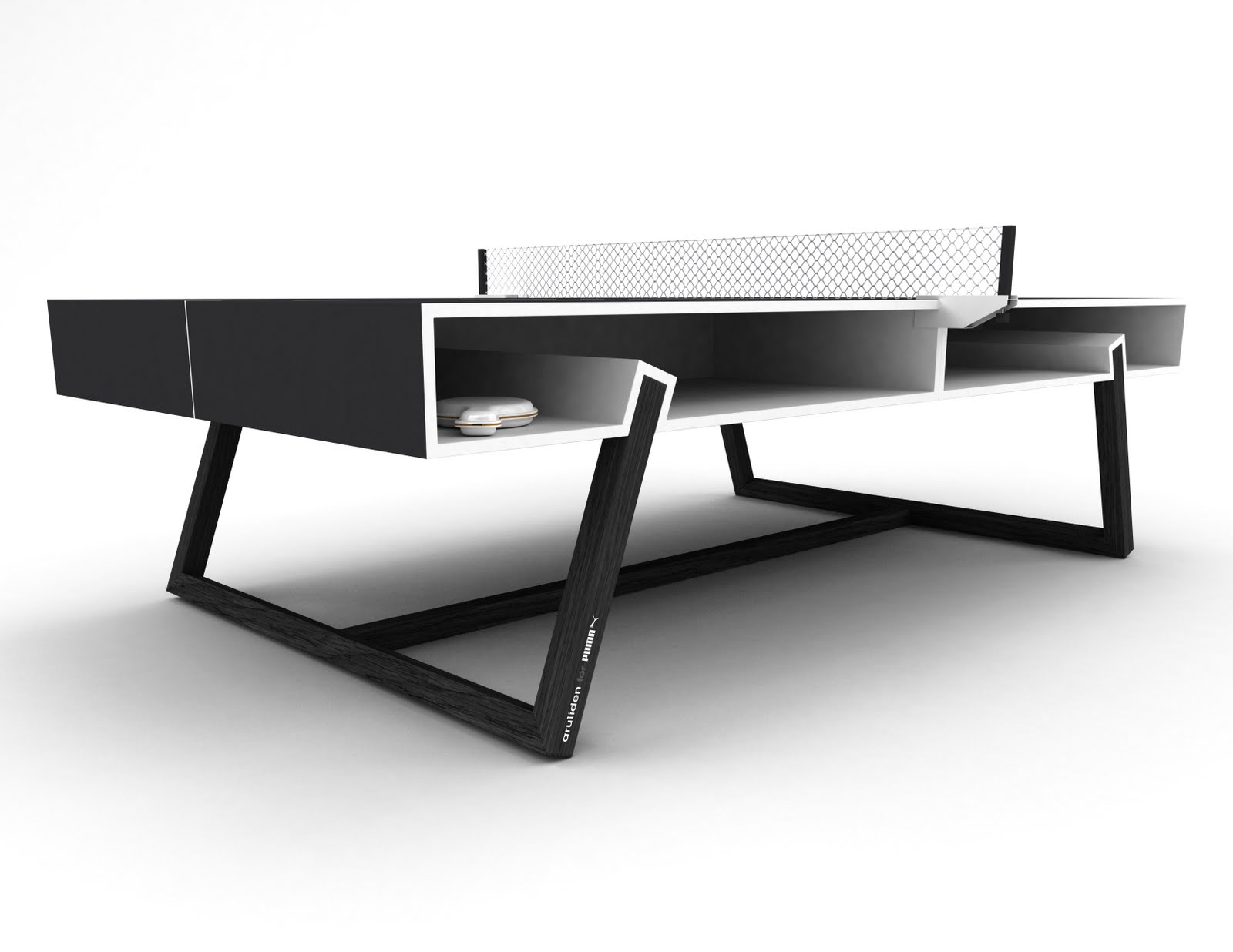 hmmm… metal chain link fence? not my favorite bit
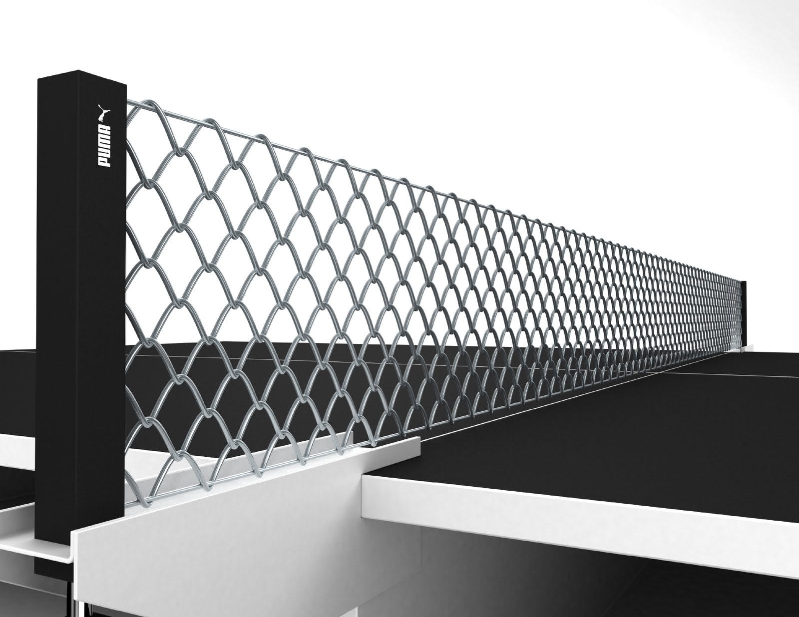
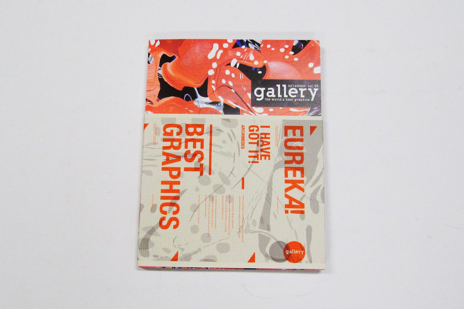 some nice work in the latest issue of gallery
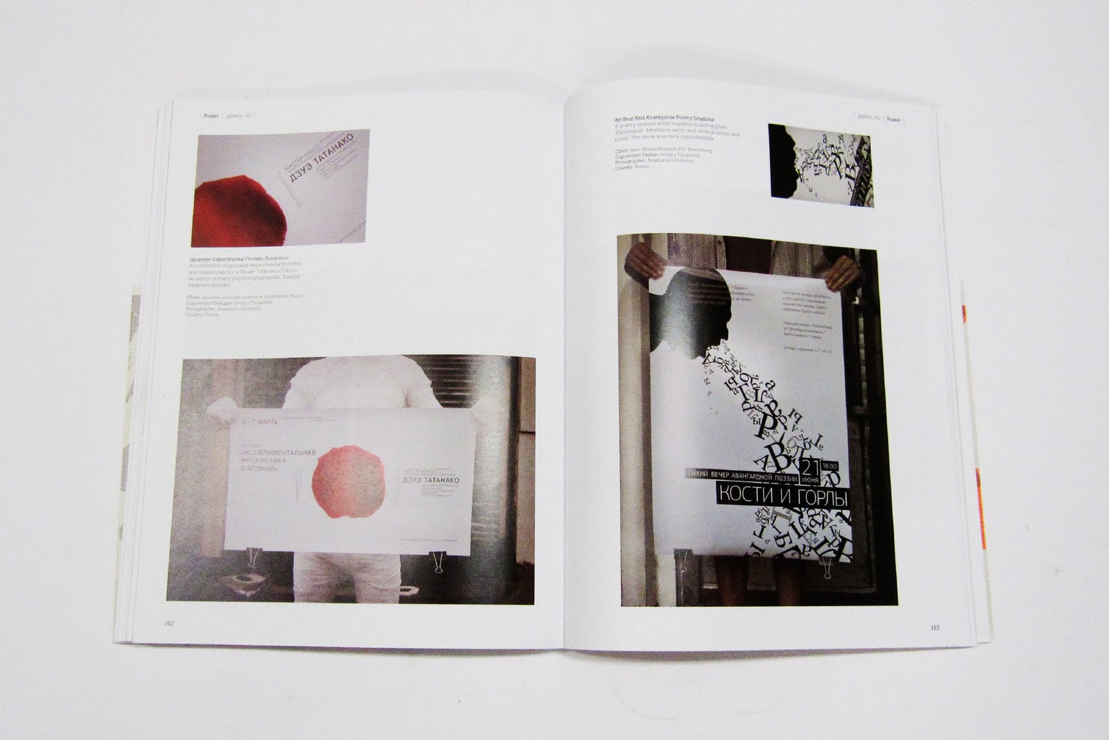 dzuae tatanako (tokyo), sergey tarasenko, anastasiya litvinenko (russia),


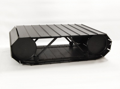
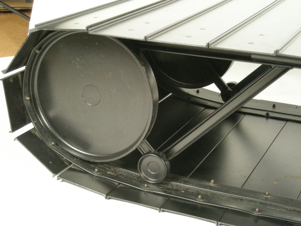
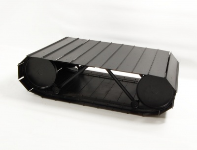 the little tank (tankette) table, by paolo pallucco and mireille rivier. i saw this coffee table at a friends house and loved the idea and finish so much that i considered getting one. it can be rolled around the house (if the floor finish can accommodates) but it’s not the most practical of coffee tables as far as what you place on top of it but its a piece to be dealt with. ca. 1987-1988 painted metal. manufactured by
  this is sort of like… one of those uber fancy parties you end up in… and everyone you talk to is bitching about something or another (yes myself included). i saw it and i just had to smile.
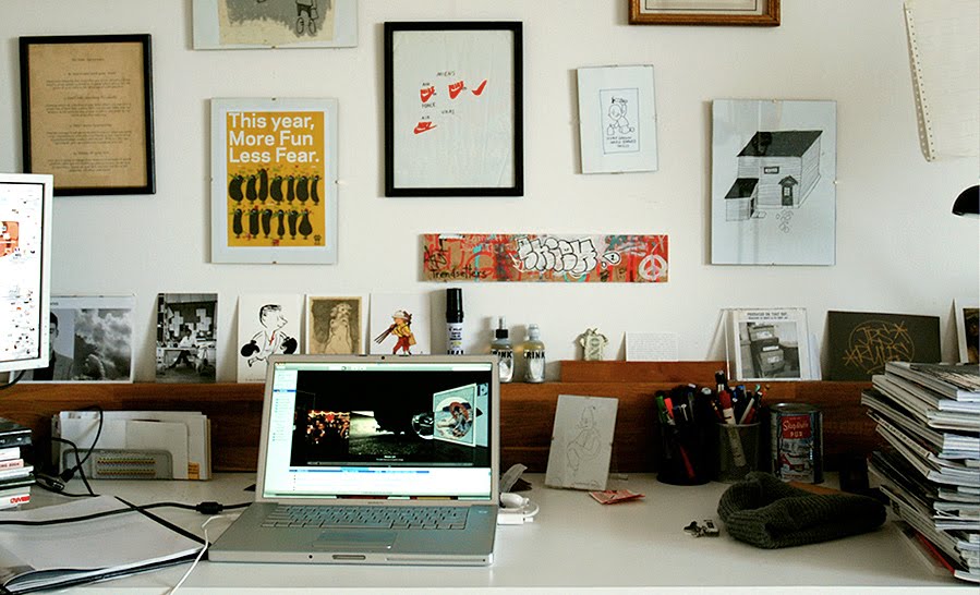
 one of ivan’s, and our favorite blogs, the JJJJound blog from montreal, canada.
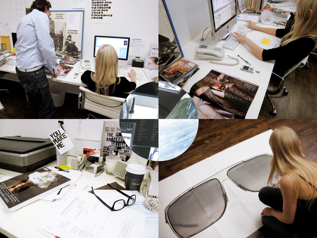 yours truely, tomorrow started, from a planet not so far away
 keehnan konyha the 2thewalls blog