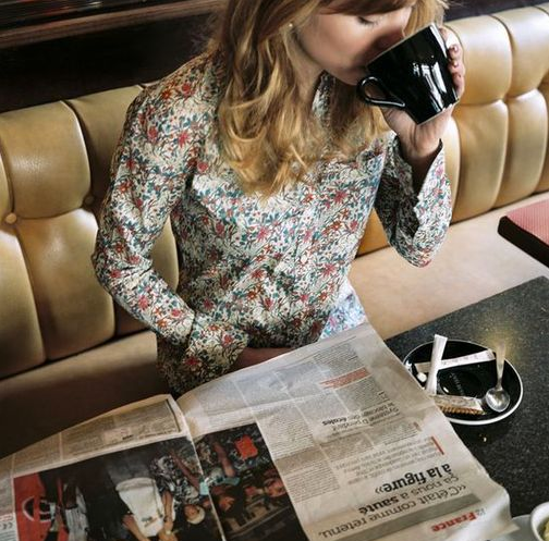


i’m sorry, it is not because i’m french and somehow chauvinist but really, french brand thomsen actually nailed the plaid/liberty shirt. when every US brands are coming over and over with the same plaid shirt that feel right out of the williamsburg salvation army ( sometime even with a $300 price tag).
those frenchies achieved doing it their own way giving it a nice “cacharel/mai ’68” look rather than a lumberjack feel. on top of that, the campaigns features some of our nicest roosters and the blog is really cool. cocorico! by pp.
NARS reflects on heather marks

we all know film/video/experimental moments are the evolution of print ads. with all of the experimentation on how to express a brand aura beyond the printed page, a lot of messiness has resulted. here we see NARS branching into time and space with simplicity and elegance. by kl
byredo – m/m
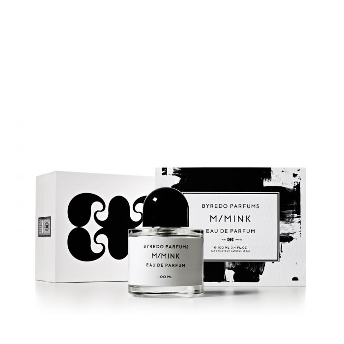
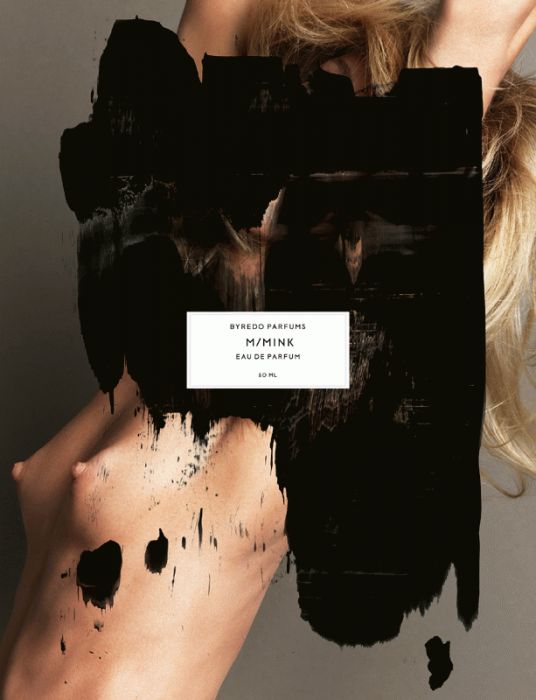
bumped into that while linking the previous post to colette site… rather (fucking) nice! by pp
yves saint laurent – still obsessed
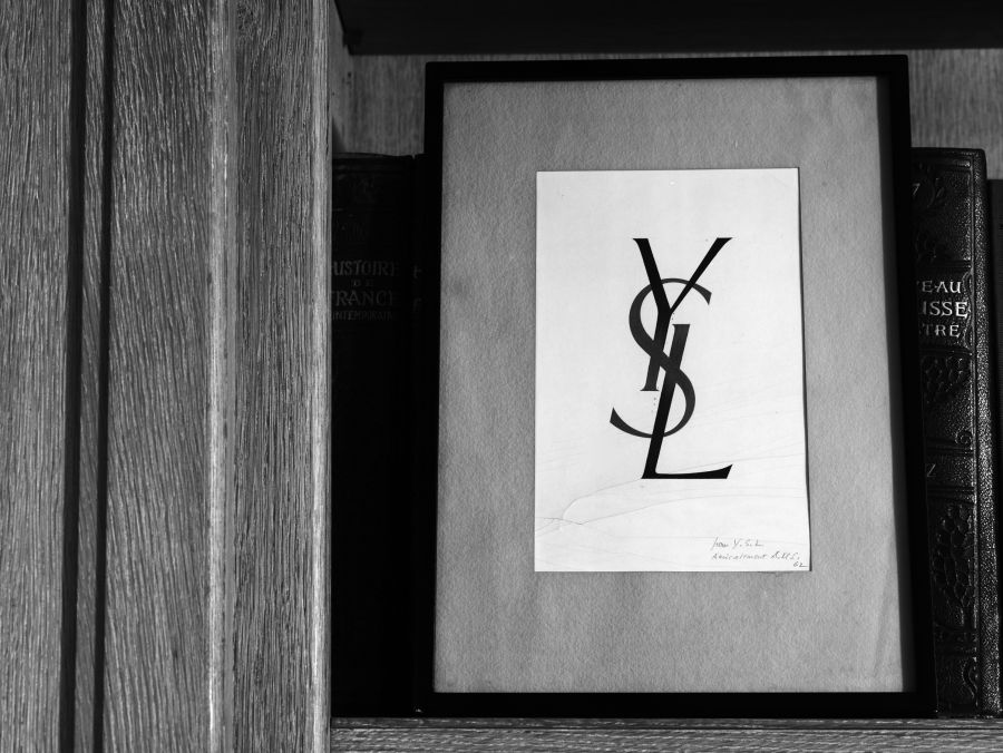


ysl (slimane, terestchenko, colette.) by pp
edward hopper a go-go
above: fendi commercial visual (horrible execution – terrible wall paint job) i doubt if karl had much to do with this, or i’m majorly disappointed, again.
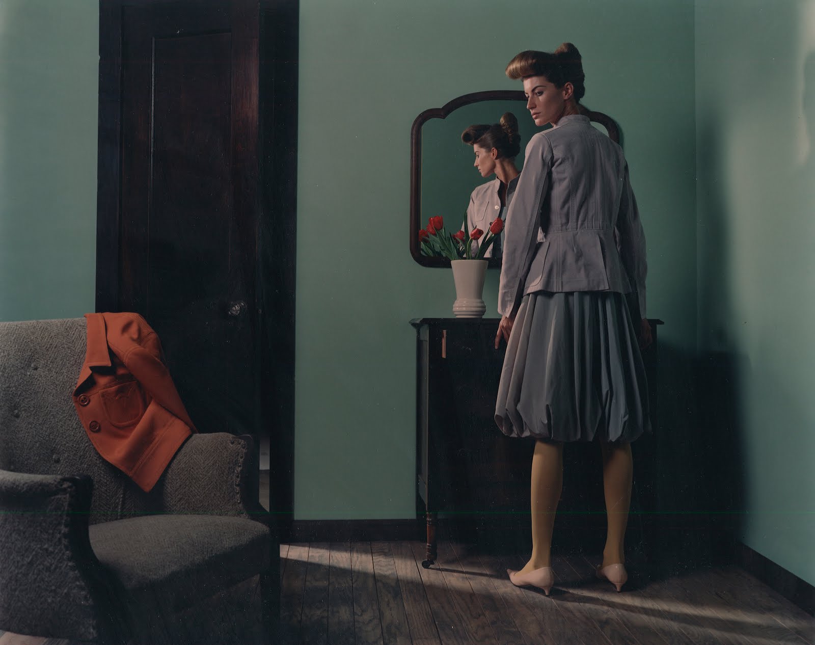
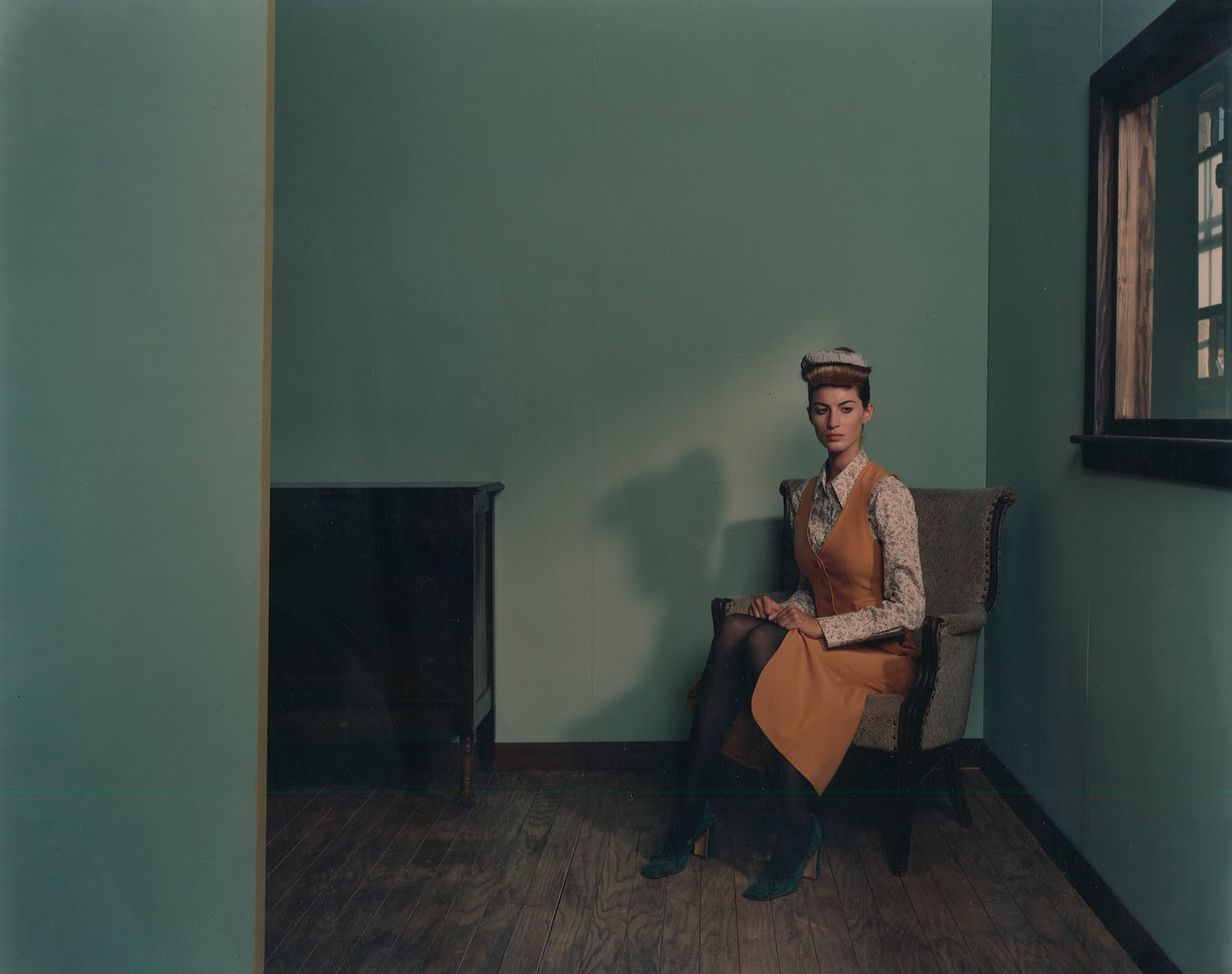 old images from “the face” with a young bookish giesel as envisioned by photographer karen collins roughly 8 years ago (with a better paint job, better girl, and better lighting!)

and of course the original edward hopper version ripped off on both… by pp + by dd
don’t forget the sun kate

summer has ended, but not for all… from the official desk of our lovely kl… sun worshipper and muse by dd
amazing, lovely, speachless: reclining nude by edward hopper
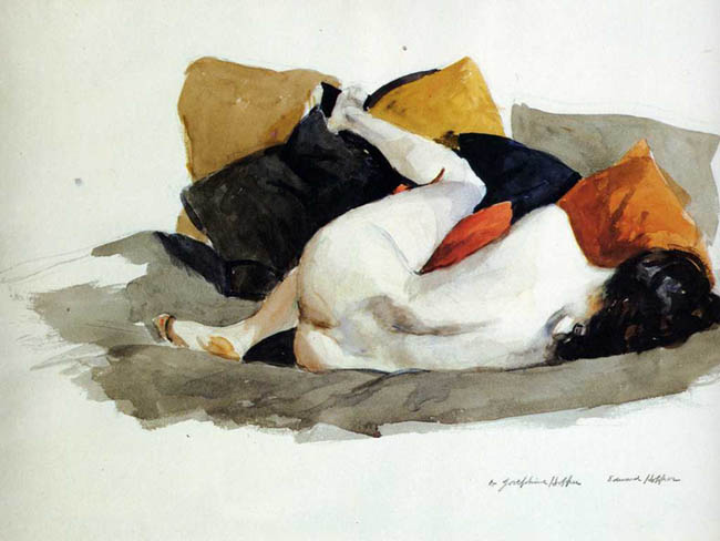
coming back from my summer vacation this image just makes me want to go back and curl up… not alone however by uh
green as envy: supreme management SS2011 show package
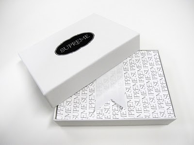
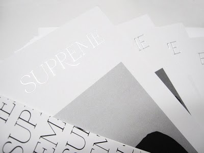
the modeling agency supreme management in new york has gone through some major changes recently. under the new direction of caroline poznanski (formerly at ford models and next) they are aiming to carve the new look away from the old guard (genius man, paul rowland see our post on his photographs). to set the tone, they just released their latest show package for the SS2011, under the creative direction of new york agency ceft and company. the cards arrived in a cloth bound white box and double sided extra thick satin ribbon. inside, is a hand full of their best girls well edited and in glorious black and white. quite a shift from their old packages.
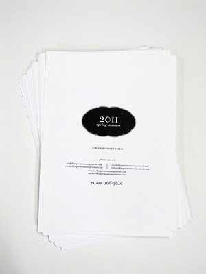
the package is not only a beautiful white box, but at heart a totally green one. the last card may be the prettiest of them all listing the processes used in the production. it states: “… designed using paperless presentations and produced with vegetable based, VOC and solvent free inks using paper from sustainable sources. the plateless printing was done at a 100% carbon-neutral plant powered by renewable energy… environmentally sound materials were selected when possible, all remaining carbon footprint was offset by planting useful trees…” planting trees? who ever knew fashion could ever be so environmentally sound? well done.
 a thumbnail set of cards, similar to that in the end of a photo book gives you an over all view of the girls to match and compare.
 models.com wrote: “their response to that challenge in the form of their debut show package is to proceed with a great dignity and a beautifully filtered taste-point that does more than just start from scratch. it starts from scratch with a quiet confidence and also a rare thing in this driven business: good manners. and therein lies their first success. from the new supreme stars like jacquelyn jablonski through to rising forces like nina porter, ieva, bregje and amanda noorgard all these girls are presented as delicately beautiful young girls touched by a classical note. already models like kel, yulia and ilva look exactly like the kind of breakthrough talent new york will subscribe to heavily… the whole affair is impeccably printed and in addition to being environmentally sound, there is a certain grace to what supreme is expressing here. at the end of the review the summary “thumbnails” of each girl’s image is a simple “thank you” to bring the offering to conclusion. “thank you ” is such a simple to say but when it is said sincerely there is no idea in the service industry that is more important or moving . the grace and dignity expressed here, both visually and spiritually, is what is going to ensure respect for supreme SS11 from the fashion community for a job executed with amazing sensitivity and fortitude. when these girls walk into their SS11 casting this is the code of elegance they will carry with them…” full article. by xy
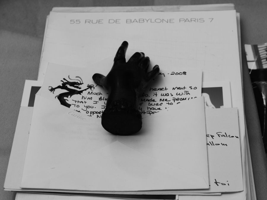
bill willis – marrakesh
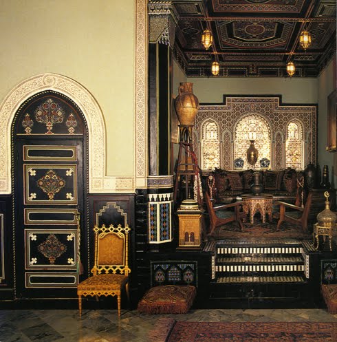


bumped into this extremely interesting article about the late marrakshi legend, decorator bill willis.
it’s in the new york times ( of course) and very well written by christopher petkanas for his column called “fabulous dead people”… how witty is that?
i could certainly tell you about mister willis but you should really read the article instead.
just to lure you a bit, mister willis lived the morocco of the 70’s around mister saint laurent, the stones, the getty’s and so on. he’s truly one of those larger than life character.
strange enough it’s rather difficult to find anything about the man on the net… so images are the same than nyt.
there should be a lot of documentation about his work in the great ivan terestchenko’s book about ysl and berge’s estates (pictures above are ysl’s marrakesh home) but i’m not sure which one can be credited to willis and which one can be credited to grange. by pp
TAVI – WHAT A JOKE!
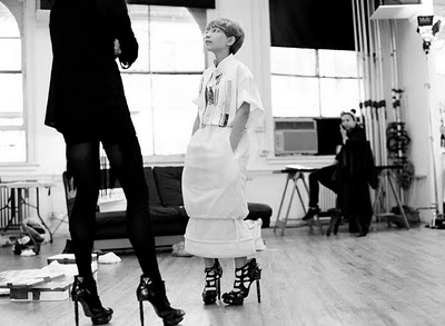
sorry, but seriously? wtf? by pp
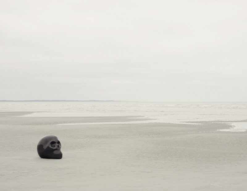
Atelier van Lieshout – more skullpture!


sensory deprivation skull, 2007. reinforced fiberglass. 59.06 x 43.31 x 53.94 inches / 150 x 110 x 137 cm. ed of 10. so awkward, love it! by pp
zavier veilhan + sebastien tellier + laurent bochet
another image of laurent bochet, featuring a skullpture of xavier veilhan to illustrate some promotional piece of singer sebastien tellier. full swing france! by pp